| Image |
Comment |
| 06/13/2005 11:33:26 PM |
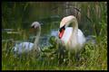
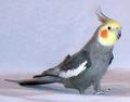
Swanning Aroundby AlexSaberiComment: Nice shot; I would like it better if the bird in the background weren't so underexposed. |
 Photographer found comment helpful. Photographer found comment helpful. |
| 06/13/2005 11:32:42 PM |
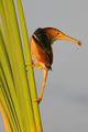
Least bitternby ovenbirdComment: This image seems to have an odd orangish cast. I think that I would have preferred to see this with a horizontal crop, adding more negative space in the direction which the bird is looking. |
| 06/13/2005 11:30:50 PM |
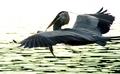
In Flight Mealby kcumanComment: Nicely captured. I would have preferred to see the bird a little less underexposed though, even if it meant washing out most of the ripples on the water. |
| Photographer found comment helpful. |
| 06/13/2005 11:29:39 PM |
|
| Photographer found comment helpful. |
| 06/13/2005 11:28:57 PM |
Starlightby chisholmsmithComment: Your bird seems fuzzy; I can't tell whether this is because of the focus, the light or the processing. The shadow behind the bird's head is distracting, and could have been eliminated by repositioning your light source relative to the camera. A stronger catchlight in the bird's eye and more light on his tail would have also improved the image. Since the bird's body is rather drab, placing him against a background which complements the color of the feathers on his head would have made this more visually appealing. |
| 06/13/2005 11:25:13 PM |
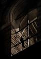
Hunter, Gathererby ImagineerComment: I had to look twice before I even saw the bird; the first thing my eye seized upon was the curve above the bird's head, which lead my gaze out of the picture. I like the texture on the wall, but there's a silhouette of a bird in the way. Shooting against (and exposing for) such a busy background takes attention away from the bird, which is presumably the intended subject of the photo. Metering on the bird and washing out the background may have produced a stronger entry for this challenge. |
| Photographer found comment helpful. |
| 06/13/2005 11:18:22 PM |
Hungry birdby RUEDISCHMUTZComment: The partially shadowed eyes are somewhat distracting, and his beak looks oversharpened. The curve of his wings leads my eyes out of the picture; a horizontal crop might have made the bird look more fierce and less lanky. A little more headroom would have been nice.
|
| Photographer found comment helpful. |
| 06/13/2005 11:15:19 PM |
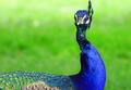
Contactby photogenixComment: I'd have liked to see more of the bird's eyes, crown or tail feathers. As it is, I feel like I've only got hints of the first two. The angle of the bird's neck highlights the ruffled feathers which disrupt an otherwise nice curve. The color of the background seems a bit more saturated than the bird itself; the presentation would have been stronger if you'd have desaturated the background somewhat.
|
| Photographer found comment helpful. |
| 06/13/2005 11:10:28 PM |
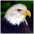
Freedomby aerogurlComment: The band of white feathers bordering the brown seem excessively white and overexposed; this probably could have been reduced / eliminated by adjusting the curves. The DOF seems a touch shallow. This is the best portrait-style picture I've seen so far in the challenge. |
| Photographer found comment helpful. |
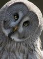
| 06/13/2005 11:07:00 PM |
Hooo whoo you looking at ?by frogletComment: The brightness difference between the bird's face and the top of it's head and shoulders is distracting; you could have probably fixed this by adjusting the curves. The face itself seems sharp, but underexposed. A catchlight in the owl's eyes would have really helped to bring this image alive. |
| Photographer found comment helpful. |
Home -
Challenges -
Community -
League -
Photos -
Cameras -
Lenses -
Learn -
Help -
Terms of Use -
Privacy -
Top ^
DPChallenge, and website content and design, Copyright © 2001-2025 Challenging Technologies, LLC.
All digital photo copyrights belong to the photographers and may not be used without permission.
Current Server Time: 08/22/2025 09:12:27 PM EDT.