| Image |
Comment |
| 08/03/2009 10:35:31 AM |
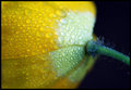
"Mixing" Cooking Oil and Dark Soya Sauceby CheerzComment: Its a little dark. I think it would have been a more effective shot if the focus was darker. Also, I might have tried putting the large blobs of soy sauce in a corner of the frame instead of right in the middle. |
 Photographer found comment helpful. Photographer found comment helpful. |
| 08/01/2009 01:36:26 PM |
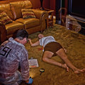
Crime Scene: The Beginning of the Afterlifeby cup4tmlComment: This is a really interesting idea.
I think what might have made this a better shot for me would be less distractions in the background. If the dead woman was laying on a dark coloured floor, then when she stood up (for the ghost effect), you wouldn't see as much of a transparency in the body. As it is now, you can tell that the dead body is a bit see-through.
I also would have like the ghost to be closer to the body... like leaning up really close to the face, or perhaps even half-way in the body and half-way out. I don't know if that was possible.
Interesting idea! |
| 07/20/2009 10:49:23 PM |
Smoking is bad for you, look what it did to my noseby ArtComment: This is the first of the photos that I've looked at so far in this challenge that I actually like. I love the lighting and the angle of the shot. My only criticism would be the blue blob in the top left corner -- I don't think it adds anything to the effect of this photo and it is a bit distracting. |
| Photographer found comment helpful. |
| 07/15/2009 05:45:01 PM |
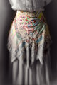
The Good Wifeby RKTComment: Okay, first, it's not a flower (yes, yes, I see the apron. What's your point?). Second, it's boring. Third, the framing is static. And fourth... hmm, well there isn't a fourth. But I just don't like it. |
| 07/15/2009 05:39:03 PM |
|
| Photographer found comment helpful. |
| 07/15/2009 05:38:22 PM |
|
| 07/15/2009 05:36:33 PM |
|
| Photographer found comment helpful. |
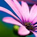
| 07/15/2009 05:26:25 PM |
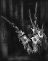
Symphony of colorsby pallComment: The colours don't look natural to me... I also don't like those two sharp lines of the petals that are in focus. It seems out of place. |
| 07/15/2009 05:05:12 PM |
|
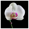
| 07/15/2009 05:04:04 PM |
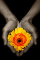
The Visitorby hazeComment: I see the visitor -- very cool! This photo gets a high mark from me. My only criticism would be the tie on the stem. Could you have moved it up higher so that it was out of the shot and tucked behind the white petal? I found it distracting. |
| Photographer found comment helpful. |
Home -
Challenges -
Community -
League -
Photos -
Cameras -
Lenses -
Learn -
Help -
Terms of Use -
Privacy -
Top ^
DPChallenge, and website content and design, Copyright © 2001-2025 Challenging Technologies, LLC.
All digital photo copyrights belong to the photographers and may not be used without permission.
Current Server Time: 08/20/2025 04:42:42 PM EDT.