| Image |
Comment |
| 04/02/2009 04:56:05 AM |
|
| 03/29/2009 02:13:30 PM |
|
 Photographer found comment helpful. Photographer found comment helpful. |
| 03/25/2009 08:54:31 PM |
8 mm by jodis_evaComment: This was the only image I gave an 8 or higher to, and as such I had it tipped for the blue. Definitely my favourite shot of the challenge, but I've never yet successfully predicted a blue, so maybe I was a curse on your image! I love the reflections in the worktop, and the focus on the film frames in the centre. |
| 03/25/2009 08:02:19 AM |
Designsby dtremainComment: Hmm... yours was my lowest placed, highest scoring shot, if you follow me... I gave you an 8 and expected you in the top 10. I thought the exposure and tones were lovely. |
| 03/23/2009 03:29:18 PM |
|
| Photographer found comment helpful. |
| 03/20/2009 09:57:55 PM |
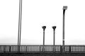
98by jaysonmcComment: I scored this a 3 originally. Then I took 2 points off as in my opinion it does not meet the challenge. The source of light for the shot is supposed to the subject of the shot. If this was at night and the light was coming from the streetlamps then it would meet the challege. As it is, the source of light in this shot appears to be the sun. |
| 03/20/2009 09:53:23 PM |
Abandonedby L800LisaComment: I scored this a 3 originally due to lack of focus and seems over sharpened. Then I took 2 points off as in my opinion it does not meet the challenge. The light source is supposed to the subject. |
| 03/19/2009 04:53:29 PM |
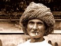
The Turbanatorby ankursomaniComment: You have asked for more comments in the gripe thread... I gave this a six which is in line with 177 other like-minded voters, 6 being the vote you received the most times. In my scale, 6 is good technical knowledge and composition, just a bit lacking in some areas.
Upon a revisit, I find that the object in the lower left hand corner to keep drawing my eye, stopping me from actually "looking" at the guy. So to improve the shot I would clone out, or crop out that part of the image. Also I find the girls behind the shoulder to be a distraction, but removing those might require a bit more work. I would have scored it more highly with those amendments as my eyes would remain fixed then on the main subject, which is a good one. Some of the other comments also mention a tighter crop which I presume is for the same reason as I suggest, the lower left corner. |
| Photographer found comment helpful. |
| 03/19/2009 03:31:22 PM |
National Geographic!by kbhatia1967Comment: Came back to comment after the gripe thread... for me the border completely detracted from the image as it is really "in your face". I also felt that the lighting was harsh, and the girls eyes lacked focus and sparkle and the shot as a whole lacks some clarity (which I guess is a byproduct of the nature of the camera). Colours framing and subject matter were fine. I scored it a 5, which appears to be the most common viewpoint with 185 others also voting it a 5. Your tags have it as "snapshot" and "candid", and I think that is a fair self-assessment. A nice enough shot but it just didn't wow me. I would probably have given it a 6 if it didn't have the yellow border. |
| Photographer found comment helpful. |
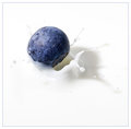
| 03/19/2009 02:07:04 PM |
Blueberry Splash Reduxby h2Comment: I revisited this after your gripe thread comment. I gave this an 8, placing your shot within my top 100. I also agree that it is better thsn the other two variants on this image. But photography is subjective. There will always be people that vote higher on dog shots, those that vote on landscapes, those that vote higher on bugs. |
| Photographer found comment helpful. |
Home -
Challenges -
Community -
League -
Photos -
Cameras -
Lenses -
Learn -
Help -
Terms of Use -
Privacy -
Top ^
DPChallenge, and website content and design, Copyright © 2001-2025 Challenging Technologies, LLC.
All digital photo copyrights belong to the photographers and may not be used without permission.
Current Server Time: 08/04/2025 08:10:11 PM EDT.