| Image |
Comment |
| 11/10/2010 01:06:31 PM |
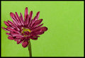
Go Greenby BackpackRComment: Technically it should be purple/yellow or red/green for complementary colours... green/purple are technically "secondary" colours - but enough science! I actually love the shot. It has a great balance and "feel" to it. Very simple, and the border works well too. I'm not going to go so far as to say this will be a top 10 finisher as there are some great takes on the challenge as competition. I will however say that this is one of my favourites, and I hope you finish well. |
 Photographer found comment helpful. Photographer found comment helpful. |
| 11/10/2010 12:55:06 PM |
spritzy aperitif by myceliumComment: Great image, nice balance and lighting. Is that sort of border legal in basic though? If so, you'll have to teach me how to do it... looks really good! |
| Photographer found comment helpful. |
| 11/10/2010 12:53:39 PM |
Broccoliby h2Comment: Crisp!
I love broccoli. Pity it's basic editing as there are a couple of (very minor) scratches on the fork which detract slightly from the image. Lighting is spot on. |
| Photographer found comment helpful. |
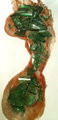
| 11/10/2010 12:51:28 PM |
|
| Photographer found comment helpful. |
| 11/10/2010 12:50:23 PM |
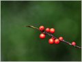
A Sprig of Berries Amongst the Evergreensby MaryOComment: Love the balance, composition, border and depth of field. I can't help feeling though that this is somewhere outside of basic editing. It looks like there is some haloing around the berries which imply a selection, with perhaps gaussian blur added to everything but the berry twig? I may be well off, so won't put in a DQ request :-) but looking at the image I do "feel" as though something is not quite right. Of course the haloing could be chromatic aberation from a telecoverter or suchlike, so I apologise unreservedly if I am wrong! I will obviously mark this entry as if it were legal. |
| Photographer found comment helpful. |
| 11/10/2010 12:36:07 PM |
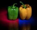
Celebrate Boldlyby JrPComment: Hmm... not quite sure what to make of this one. Orange and blue are complementary colours ok, but the green has such a prominance in this shot without it's complementary of red being present. Whilst I wouldn't go so far as to say that this does not meet the challenge, I do feel as though it is slightly off kilter with the challenge. I sort of find the stem distracting in a number of places - i.e. where it is to the left of the centre line - I think it would look better if it were full on the line. Also the blurred section in the glass, although I realise this is due to the shape of the glass rather than your technique. |
| 11/10/2010 12:31:18 PM |
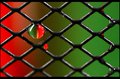
Green & Red - Rosesby lccm_82Comment: I feel that this shot lacks a point of sharp focus or clarity. I also think the border is overstated and detracts overall. I do however love the colour balance which squarely meets the challenge, and the overall "mood" of the shot. |
| 11/10/2010 12:27:59 PM |
red/greenby libertyComment: Well executed. This type of shot isn't as easy to achieve as it looks, and the colours are spot on for the challenge. Nice to see something other than flowers/fruits. The only distraction and detraction from the image is the secondary drip below the main one. I realise this is basic editing, but I think this shot would have more impact if that were removed. |
| Photographer found comment helpful. |
| 11/10/2010 12:25:57 PM |
....and I would walk on broken glass.....by taff209Comment: Interesting idea, certainly different. Seems to lack clarity though... either focus or sharpening... and the reflection of light on some of the glass is a bit harsh. Finally, I would boost the red channel in a hue/saturation layer to make it really vibrant as at the moment it looks a bit orangey. Kudos for doing something different though. |
| Photographer found comment helpful. |
| 11/10/2010 12:20:04 PM |
|
Home -
Challenges -
Community -
League -
Photos -
Cameras -
Lenses -
Learn -
Help -
Terms of Use -
Privacy -
Top ^
DPChallenge, and website content and design, Copyright © 2001-2025 Challenging Technologies, LLC.
All digital photo copyrights belong to the photographers and may not be used without permission.
Current Server Time: 12/20/2025 09:06:54 PM EST.