| Image |
Comment |
| 11/10/2010 03:44:30 PM |
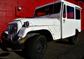
White Jeepby gminkComment: My interpretation of the challenge is quite narrow. Complementary colours sit opposite each other on a colour wheel. As white does not feature on the colour wheel, and red sits opposite green, in my eyes this image does not meet the challenge. I'm sure there will be others with a complementary viewpoint! I will be knocking off a couple of points for my perception that this does not meet the challenge. |
| 11/10/2010 03:44:28 PM |
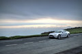
Black & Silverby thedoginthebogComment: My interpretation of the challenge is quite narrow. Complementary colours sit opposite each other on a colour wheel. As neither black nor silver feature on the colour wheel, in my eyes this image does not meet the challenge. I'm sure there will be others with a complementary viewpoint! I will be knocking off a couple of points for my perception that this does not meet the challenge. |
| 11/10/2010 03:44:25 PM |
Black and Whiteby kprasad9375Comment: My interpretation of the challenge is quite narrow. Complementary colours sit opposite each other on a colour wheel. As neither black nor white feature on the colour wheel, in my eyes this image does not meet the challenge. I'm sure there will be others with a complementary viewpoint! I will be knocking off a couple of points for my perception that this does not meet the challenge. |
| 11/10/2010 01:37:43 PM |
Cold Autumn Rainby briantammyComment: I'v not getting any sense of complementary colours from this image at all apart from a tiny splash of what might be purple and yellow in the droplet. Perhaps that was all that was intended but I would expect to see the colours used compositionally rather than as an accent. |
 Photographer found comment helpful. Photographer found comment helpful. |
| 11/10/2010 01:35:07 PM |
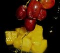
Wet Fruit Canvasby AleemaComment: I'm not quite getting the "complementary" colours from this... red and yellow are not complimentary. Red/green or yellow/purple would get you squarely in the challenge. This is a little skewed from that - not quite enough for me to mark it down as a DNMC though... I'll cut you a little slack in case you are considering the grapes as purple :-) I find the drips on the right hand side really distracting. This would be a more impactive image without them. |
| Photographer found comment helpful. |
| 11/10/2010 01:31:34 PM |
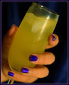
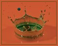
the complimentary complementary drinkby kellmak10Comment: You have just received my 15,000th vote on DPC. It was a 7. :-)
I really like the compositional angle, and the take on the challenge. You also managed to pick complementary colours unlike many of your competitors. I even like the border, which is a change for me! I do feel as though this image could do with a little more space to breathe though, both above the glass and under the pinky finger. It's making me thirsy for a glass of Buck's Fizz this one is :-) |
| Photographer found comment helpful. |
| 11/10/2010 01:27:41 PM |
sweet dewby liangdaweiComment: Not getting the complementary colours in this shot. Complementary colour of yellow is purple (missing) and complementary colour of orange is blue (also missing). You have chosen analagous colours rather than complementary colours. So, depite the fact that it's really nice shot, and I like it very much as an image in itself, I will be marking this down a few points for my perception that this does not meet the challenge. |
| Photographer found comment helpful. |
| 11/10/2010 01:23:58 PM |
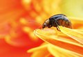
"we are all the same inside"by ThaiComment: That we are. I find my eye wandering a little around this image, probably because of a lack of crisp focus on the main focal points of the peppers. A nice concept though, and the red/green falls squarely into the challenge remit (unlike some of your competition). |
| Photographer found comment helpful. |
| 11/10/2010 01:22:17 PM |
Rubies and Emeraldsby ChandiComment: Technically complementary colours are red/green or orange/blue so you've got a bit of a hybrid going on here. Orange and green are actually "secondary" colours to purple. Although the title says "rubies" I think it's a strectch to consider this as red. The actual capture is nice enough, although this type of shot is done to death so you may get marked down by some for lack of originality (not me though). I do however feel that the border completely detracts from the image. The thin red line around the green just looks angry. |
| Photographer found comment helpful. |
| 11/10/2010 01:07:41 PM |
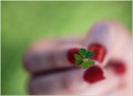
Unlucky cloverby erikingComment: I would have preferred just a little larger depth of field, bringing some of the fingernails into focus a little. Nice compositional balance though, and red/green is slap bang on the challenge (unlike some of the competition!) |
| Photographer found comment helpful. |
Home -
Challenges -
Community -
League -
Photos -
Cameras -
Lenses -
Learn -
Help -
Terms of Use -
Privacy -
Top ^
DPChallenge, and website content and design, Copyright © 2001-2025 Challenging Technologies, LLC.
All digital photo copyrights belong to the photographers and may not be used without permission.
Current Server Time: 08/08/2025 10:52:06 AM EDT.