| Image |
Comment |
| 02/26/2013 08:47:02 AM |
|
 Photographer found comment helpful. Photographer found comment helpful. |
| 02/26/2013 08:43:57 AM |
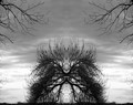
Shellby DistantColoursComment: I had to come back to this a couple of times as I couldn't make up my mind if the top of the image works for or against the overall merit of the image. I've settled on work against - everything else just seems to perfect then you view the top and you kind of question why you think that way. I think it's the imperfection as compared to the rest of the image that is annoying. Also the whites are just a tad over done. |
| Photographer found comment helpful. |
| 02/26/2013 08:41:02 AM |
|
| Photographer found comment helpful. |
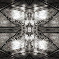
| 02/26/2013 08:40:20 AM |
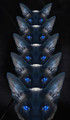
kaleidascopeby tangueraComment: Looks almost like back scatter interference from a electron microscope. Very simple and elegant - nothing wrong from an artistic or technical standpoint, it is just uninteresting to this observer - no pop or wow factor. |
| Photographer found comment helpful. |
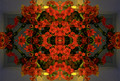
| 02/26/2013 08:37:49 AM |
Ganesh Mandalaby dougi555Comment: The one little reflected light is over done and ruins the overall effect. Others may disagree, but I think a little less white bloom would have been much better. The color is great - love the earthy tone to it. |
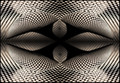
| 02/26/2013 08:35:36 AM |
Dotsby tamatamaComment: I can't decide if the center focus distracts or adds to this image. From an artistic point of view, this is an interesting image and it's technically competent, I just can't decide if I like it or not. Always error on the side of the author - in this case an 8 instead of a 6. |
| Photographer found comment helpful. |
| 02/26/2013 08:33:31 AM |
|
| Photographer found comment helpful. |
| 02/26/2013 08:32:35 AM |
Scavengerby Bear_MusicComment: The tire and buoy shadows make this a very attractive image. The two ropes on the other hand distract from the image - they just look weird where the join was made. Other than that, it's a very elegant and simple image that has a great deal of pleasing tones and color. Very nicely done. |
| Photographer found comment helpful. |
| 02/26/2013 08:29:23 AM |
Unnatural Landscapeby tvsometimeComment: I wonder if the author noticed the gate like outline at the bottom of the image in the center - that makes the whole difference in this image. I can imagine this as a cover image for a fantasy novel or horror movie. Really nice image although it's a little busy around the edges of the central subject. Still, a good entry into the challenge. |
| Photographer found comment helpful. |
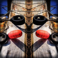
| 02/26/2013 08:27:03 AM |
Club that Seal, Boyby raishComment: At first I liked this - still do, but the cut and paste is way too obvious as the edges are much too sharp - distracts from the image as a whole. There is also a slight feathering around the cut outs which is the result of over sharpening - or it looks like over sharpening. |
| Photographer found comment helpful. |
Home -
Challenges -
Community -
League -
Photos -
Cameras -
Lenses -
Learn -
Help -
Terms of Use -
Privacy -
Top ^
DPChallenge, and website content and design, Copyright © 2001-2025 Challenging Technologies, LLC.
All digital photo copyrights belong to the photographers and may not be used without permission.
Current Server Time: 08/14/2025 03:59:29 PM EDT.