| Image |
Comment |
| 04/06/2009 08:00:06 PM |
Hailes Abbeyby GemGemComment: The author has treated the stand alone arches of the Abbey with a very different angle and it's effective. A good font choice, although a slightly more ornate font would be more suitable. Balanced and effective. |
 Photographer found comment helpful. Photographer found comment helpful. |
| 04/06/2009 07:57:26 PM |
|
| Photographer found comment helpful. |
| 04/06/2009 07:55:52 PM |
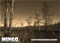
National Wildlife Refugeby tfarrell23Comment: This is so iconic of SE Missouri - I can't say enough about the way the author handles this image from the font to the overall feel of a great wetlands area. |
| Photographer found comment helpful. |
| 04/06/2009 07:52:49 PM |
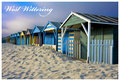
West Witteringby bobonacusComment: I'm not going to say anything other than perfect - absoutely perfect top to bottom, right to left. Wonderful. |
| Photographer found comment helpful. |
| 04/06/2009 07:52:07 PM |
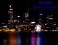
My placeby Delta_6Comment: What is it with you Aussies and the great images y'all produce? :>) The highlights are a little over done and the central ferris wheel bloom draws the eye away form the rest of the almost perfect image. The font selection is good, but the color should be a little more subdued - that's a personal selection as it works are it is. Nice composition and good execution with a couple of minor issues. |
| Photographer found comment helpful. |
| 04/06/2009 07:50:03 PM |
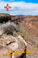
Rio Grande Gorgeby chefsamComment: Effective treatment with the bridge only emphasizing the depth and grandeur of the gorge. The font works, but it's placement is suspect - it might have worked better with complimentary colors to the color tones of the image - the red and yellow just jump out at you and they don't treat the image with any respect. |
| 04/06/2009 07:47:51 PM |
Jerash, Antioch on the Golden Riverby ahmadbaaraComment: An appropriate treatment of this location. The font and it's placement outside the image treat the image with the respect it deserves. Very pleasant to look at and not commercial. Well done. |
| Photographer found comment helpful. |
| 04/06/2009 07:46:00 PM |
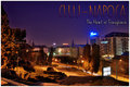
Cluj-Napocaby GiorgioComment: A very pleasant mix of color and style - almost iconic. Highlights are right on the edge which is a plus. The bill board is a distaction, but not completely a negative. The font mix is well thought out and it works very well. Well done. |
| Photographer found comment helpful. |
| 04/06/2009 07:44:28 PM |
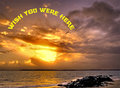
Wish You Were Hereby BrianRComment: The yellow is a little over the edge. The font treatment is very effective and clever. Overall the image is crip and sharp although where is here? :>) |
| Photographer found comment helpful. |
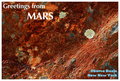
| 04/06/2009 07:43:09 PM |
|
| Photographer found comment helpful. |
Home -
Challenges -
Community -
League -
Photos -
Cameras -
Lenses -
Learn -
Help -
Terms of Use -
Privacy -
Top ^
DPChallenge, and website content and design, Copyright © 2001-2025 Challenging Technologies, LLC.
All digital photo copyrights belong to the photographers and may not be used without permission.
Current Server Time: 08/08/2025 06:55:53 PM EDT.