| Image |
Comment |
| 04/06/2009 08:53:08 PM |
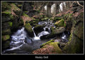
Just wanted to say hi...by redpandaComment: Terrific detail and very effective message. I can't even find a nit to pick.
A top ten entry in the challenge for sure. |
 Photographer found comment helpful. Photographer found comment helpful. |
| 04/06/2009 08:52:16 PM |
|
| Photographer found comment helpful. |
| 04/06/2009 08:51:56 PM |
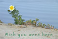
On the edgeby jnenvirComment: Delightfully whimsical imagery. The font was an unfortunate selection as it interfers with the sand and looks incomplete - the same font in a full bold or solid would have helped a lot. The font color is fine and works well with the rest of the image. |
| Photographer found comment helpful. |
| 04/06/2009 08:49:09 PM |
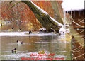
Park Rapids, MNby PikkelComment: A busy image and not very well focused - it's really a DOF problem. The font and color are difficult to read. this might have worked better if taken in large format .jpg or RAW and cropped to center on the birds. |
| 04/06/2009 08:44:04 PM |
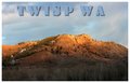
Twisp Washington Stateby riversongComment: I was trying to think of where Twispwa was, then I got it. :>) Missing a comma. A nice image, interesting lighting and fairly well detailed although a bit uninteresting. |
| Photographer found comment helpful. |
| 04/06/2009 08:40:07 PM |
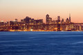
The Emerald Cityby Brent_SComment: When reviewing competitions like this, city scapes seem to be the thing to do and it's hard to view another image and stay fresh while reviewing so that you give the authors a fair shake. Then up comes a fresh treatment of a city scape and you are renewed. This is one of those images that, while similar to the others, is very different in how it was handled. The reflections are perfect and compliment the light and structures in a pleasing way. The subtle change from brilliant colors to pastels on the water is very pleasing to the eye. The font is good, the color might have been a little more subtle to compliment the image. Well done. |
| Photographer found comment helpful. |
| 04/06/2009 08:36:50 PM |
City by the Bayby PhilipDyerComment: A terrific image with contrasting color and tone. Very effective treatment of a city scape. A proper font and color for this would need custom treatment to compliment the image itself. |
| Photographer found comment helpful. |
| 04/06/2009 08:35:08 PM |
Columnated Street Jarashby HighNoonerComment: Another excellant treatment of an iconic area of the world. Lush greens and yellows only serve to compliment the earth tones of the columns. The font is a great selection to compliment the columns. Well done. |
| Photographer found comment helpful. |
| 04/06/2009 08:33:56 PM |
Monument Valleyby ZeusComment: Yes it is Monument Valley and one of the best treatments I've seen in a while. Excellant font selection and placement. A perfectly saleable image for a post card. Well done. |
| Photographer found comment helpful. |
| 04/06/2009 08:33:03 PM |
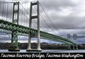
Tacoma, Washingtonby PhotomouseComment: The image has a soft focus which works - maybe a by product of HDR processing? the image is effective though and that is a plus. The bottom border is well executed, but detracts from the image. If the image were sharper, it wouldn't be as distracting. |
| Photographer found comment helpful. |
Home -
Challenges -
Community -
League -
Photos -
Cameras -
Lenses -
Learn -
Help -
Terms of Use -
Privacy -
Top ^
DPChallenge, and website content and design, Copyright © 2001-2025 Challenging Technologies, LLC.
All digital photo copyrights belong to the photographers and may not be used without permission.
Current Server Time: 08/09/2025 02:31:42 AM EDT.