| Image |
Comment |
| 04/06/2009 09:56:09 PM |
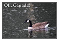
Oh Canada!by NobodyComment: Very clever and unique. The font and drop shadow compliment the overall effect of what the author wanted to convey as an impression of Canada. |
 Photographer found comment helpful. Photographer found comment helpful. |
| 04/06/2009 09:54:54 PM |
Beautiful BCby tooterComment: A sense of space and wilderness - that river just begs to be explored and fished. The use of a subtle font and color enhances the overall effect. Very nicely executed. |
| Photographer found comment helpful. |
| 04/06/2009 09:52:23 PM |
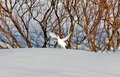
Ptarmiganby diverssComment: This would make a good background image for a hunting lodge card or similar. The little white blooms typical of a snow shot are distracting - not by much though. |
| Photographer found comment helpful. |
| 04/06/2009 09:50:31 PM |
|
| Photographer found comment helpful. |
| 04/06/2009 09:49:51 PM |
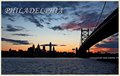
Welcome to Philadelphia!by DeniseComment: Very dramatic image, but it would have helped to have some light in the city itself. It's also not emblematic of Philadelphia as it's similar to several photographs in this challenge. |
| Photographer found comment helpful. |
| 04/06/2009 09:43:35 PM |
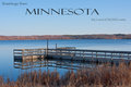
Greetings from Minnesotaby davidwComment: A very good impression of the out doors and Minnesota in general. The font is a good selection and it's placement is efficient and effective. A good representative post card for the Land of 10,000 Lakes and in particular Lake Woebegone. |
| Photographer found comment helpful. |
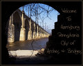
| 04/06/2009 09:42:01 PM |
Welcome to Harrisburg!by NikonJebComment: The dangling vine doesn't help this image much at all. It would have helped to move it out of the way. I do like the concept and the idea behind the composition, but the execution fails to impress. The font and placement is good. |
| Photographer found comment helpful. |
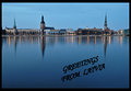
| 04/06/2009 09:40:41 PM |
Latviaby kolasiComment: A little less space in the foreground would have helped this image and created a more dynamic impact with the cityscape in the background. The font selection is good and a good contrasting color. |
| Photographer found comment helpful. |
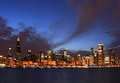
| 04/06/2009 09:38:41 PM |
CHICAGOby GaiaComment: After seeing a number of these very similar images from Sydney to Seattle to Hong Kong to Malaysia, you get a little jaded and tired trying to treat each one as unique and giving the entries the respect they deserve. Then there is this - its similar, yet different in detail. The Chicago 2016 theme is a good one and it works well. It might have helped to put Chicago 2016 somewhere in the image or in a border along the bottom, but the image works as it is - very well composed, no a single highlight blow out, nice mix of tone and shades of tones - is a great one. Well done. |
| Photographer found comment helpful. |
| 04/06/2009 09:35:15 PM |
|
| Photographer found comment helpful. |
Home -
Challenges -
Community -
League -
Photos -
Cameras -
Lenses -
Learn -
Help -
Terms of Use -
Privacy -
Top ^
DPChallenge, and website content and design, Copyright © 2001-2025 Challenging Technologies, LLC.
All digital photo copyrights belong to the photographers and may not be used without permission.
Current Server Time: 08/09/2025 05:25:18 AM EDT.