| Image |
Comment |
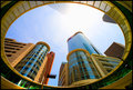
| 08/02/2009 10:51:33 PM |
Into The Sunby scarbrdComment: The difficulty here is the sky, but the author handled it quite well - the temptation would have been to under expose but the author obviously avoided that. The framing is very intriguing and something not often seen - a good eye for balance and framing is in evidence here. I particularly like the way the building disappears into the sun - unique. A solid effort and a very nice capture with plenty of shapes and color to invite the eye. Well done. |
 Photographer found comment helpful. Photographer found comment helpful. |
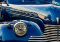
| 08/02/2009 10:44:17 PM |
Blue Chevyby izadoodleComment: I love old cars and own a couple myself. One of the things that annoys the heck out of me when I take images of my own cars is that the finish is flawless which presents a problem - it reflects what is behind the photographer. In this case, the nice smooth curves and background color are disturbed by the backgrounds. Having said that, it's a personal peeve because you can't always control that in the open (my cars have been done professionally in a studio it annoyed me so much) and that shouldn't detract from the image as presented. Very pleasing capture, sharp, crisp and detailed showing the pleasing metal work and natural curves and craftmanship. Well done. |
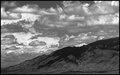
| 08/02/2009 10:37:22 PM |
Storm Frontby bobnospumComment: I have been experimenting with this type of image and in general, have received about the same results. In my opinion, the foreground is much more dramatic than the sky which I don't think is what was intended. What I discovered in my own explorations of similar images, is that the more dramatic the sky, the more dramatic the image - don't ask me why. In this case, it might have been better to work with the shadows and highlights of the sky and then worked them against the foreground. There is a dichotomy here - the sky is as detailed as the foreground, but the results, in particular with black and white, aren't as effective as they could be - the rather complex shapes, tone and shadows of the clouds are lost and the image feels forced and not at all natural. If it were my image, I would take the original and tweak the tone and/or curves control, then touch up with shadows/highlights to even out the image, then slowly ratchet up those same controls until I got the sky to be more dramatic than the foreground. It is a nice image, don't misunderstand me, but it could use some help to make it truly outstanding. |
| Photographer found comment helpful. |
| 08/02/2009 10:31:03 PM |
passageby krnodilComment: This is one of those images that you either like or hate if only because it's - well ethereal and rather dramatic. Personally, I like the statement and the treatment - it's sort-of spooky in a sense almost as if the soul is on the edge of being gone to the beyond. Being a fantasy/sci-fi fan, this image is envokes several sci-fi classics in the fantasy genre and I like it if only because it's rather unreal nature. Well done. |
| Photographer found comment helpful. |
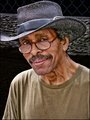
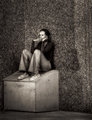
| 08/02/2009 10:27:14 PM |
A Guy I Met in the Parkby pwm6Comment: There is a story to be told and this image only tells part of it - there is a lot in this candid - mystery, mischief - a character for the ages perhaps lost in time or perhaps not. Kind of reminds me of a Terry Pratchett character - The Duck Man. Solid candid with a lot of recommend it. No major technical or artistic issues. Well done. |
| Photographer found comment helpful. |
| 08/02/2009 10:24:44 PM |
Despairby ZigomarComment: A very good candid which matches it's title - nice capture with a lot of definition, good off center subject and very gentle properly controlled DOF. While the image has a lot of plus factors, the rather narrow crop could be viewed as a negative, but in this case it works extremely well. The contrast between the subject and his surroundings is interesting - a commentary on a solitary soul vs the rather social gatherings the subject is set with. Very nice job and good solid photojournalism. |
| Photographer found comment helpful. |
| 08/02/2009 10:19:20 PM |
Smoke Breakby artvetComment: If there was ever a sign of the times, it's the cellphone. Combined with the "smoke break" atmosphere of this image, it's a very good candid capture. I feel, however, that the image appears to be be a little "flat" with no feeling for depth - it just looks very two dimensional. A little different angle on the shot or a little more distance would have helped give it some depth and more definition. Still, a very nice candid. |
| Photographer found comment helpful. |
| 08/02/2009 10:13:24 PM |
Mini Calla Lilliesby DCrest01Comment: Simple elegance - beautiful imagery with all the gentle sweeping curves and wonderful blends of colors and shapes. A solid 10. |
| Photographer found comment helpful. |
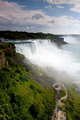
| 08/02/2009 10:12:24 PM |
The Fallsby Five_SeatComment: The image is a little tall and the exposure is a little underdone - the color is uneven when viewed as a whole, but if the tourist walkway is cropped, the image comes back to the viewer as interesting needing only a little tweaking of exposure controls and shadow/highlight controls. A solid effort. |
| Photographer found comment helpful. |
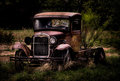
| 08/02/2009 10:07:32 PM |
My Old Manby JulietNNComment: There are times when complimenting the photographer just isn't enough. This is an incredible image and one that should just be enjoyed. A perfect image of a great old truck. My compliments to the author. |
| Photographer found comment helpful. |
Home -
Challenges -
Community -
League -
Photos -
Cameras -
Lenses -
Learn -
Help -
Terms of Use -
Privacy -
Top ^
DPChallenge, and website content and design, Copyright © 2001-2025 Challenging Technologies, LLC.
All digital photo copyrights belong to the photographers and may not be used without permission.
Current Server Time: 08/19/2025 07:12:19 PM EDT.