|
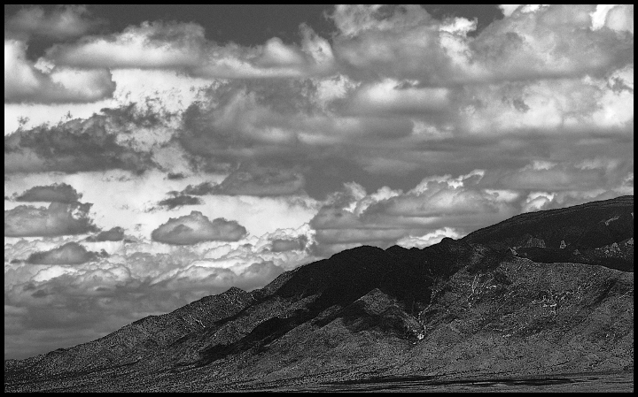
I have been experimenting with this type of image and in general, have received about the same results. In my opinion, the foreground is much more dramatic than the sky which I don't think is what was intended. What I discovered in my own explorations of similar images, is that the more dramatic the sky, the more dramatic the image - don't ask me why. In this case, it might have been better to work with the shadows and highlights of the sky and then worked them against the foreground. There is a dichotomy here - the sky is as detailed as the foreground, but the results, in particular with black and white, aren't as effective as they could be - the rather complex shapes, tone and shadows of the clouds are lost and the image feels forced and not at all natural. If it were my image, I would take the original and tweak the tone and/or curves control, then touch up with shadows/highlights to even out the image, then slowly ratchet up those same controls until I got the sky to be more dramatic than the foreground. It is a nice image, don't misunderstand me, but it could use some help to make it truly outstanding. |