| Image |
Comment |
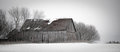
| 01/01/2009 08:55:27 PM |
Week-1.jpgby bauerfan71Comment: I was also thinking it would be nice to see more of the open space, very nice shot however. |
 Photographer found comment helpful. Photographer found comment helpful. |
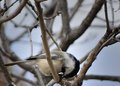
| 01/01/2009 08:05:27 PM |
Chickadee - Week 1by lunachickenComment: Nicely captured shot, though I feel the bird is a bit close to the bottom of the frame.
Can't wait to see how you go with the new lens. I'm thinking of buying something similar as I don't have a tele zoom at all just now! |
| Photographer found comment helpful. |
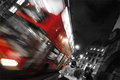
| 01/01/2009 08:01:04 PM |
New year New country Old moonby raishComment: I like the stillness of the whole scene, the unmoving flag, the leaves on the ground, and the sky with the moon all make it look very quiet and still, and then you have the person walking through the middle of the shot, makes a perfect contrast to the rest. |
| Photographer found comment helpful. |
| 01/01/2009 07:56:52 PM |
Crow Creek Mine #001by ShutterPugComment: This is a great show shot. Took me a few seconds to figure out what sort of scale I was looking at though. I really like the gentle shadows in the snow contrasting against the harsh textures of the cabin and background trees. |
| Photographer found comment helpful. |
| 01/01/2009 07:24:57 PM |
IMG_0974by ryandComment: I'm not usually a big fan on selective B&W, though it seems to work well here. Would be nice to see this one with reduced saturation rather than B&W on the selected areas. |
| Photographer found comment helpful. |
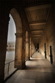
| 01/01/2009 07:23:20 PM |
IMG_1170by ryandComment: Nice shot, great tones. This looks more like Italy than London or Paris though, you should put the location in the comments. |
| Photographer found comment helpful. |
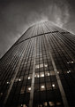
| 01/01/2009 07:21:37 PM |
IMG_1190by ryandComment: Great shot, love the fact that the clouds directly around the top of the building are brighter making the building look somehow alive! |
| Photographer found comment helpful. |
| 01/01/2009 06:51:08 PM |
My Mother.by remboComment: I don't think the contrast of the brightly coloured top and the black background work too well here. The portrait itself is nice, but the black background is actually distracting because of its harsh contrast with the lady. |
| Photographer found comment helpful. |
| 01/01/2009 06:50:12 PM |
Remembrance...by NikonJebComment: This is a nice shot, but there are 2 things which I feel could have improved it. The first is that the frames of the glasses are partially covering the eyes, and from what I can see, there is an interesting expression there so it makes me want to see the eyes better. The second is that there seems to be a slight blur, perhaps motion blur in the shot, probably a result of the shutter speed being too slow. |
| Photographer found comment helpful. |
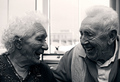
| 01/01/2009 06:47:18 PM |
dear old nan & grandadby dainmcgowanComment: Great shot, and good use of b&w to highlight the details and textures. Skin tones seem a touch dark though, as though you applied a blue filter or some similar effect. Like it a lot though, 7. |
| Photographer found comment helpful. |
Home -
Challenges -
Community -
League -
Photos -
Cameras -
Lenses -
Learn -
Help -
Terms of Use -
Privacy -
Top ^
DPChallenge, and website content and design, Copyright © 2001-2025 Challenging Technologies, LLC.
All digital photo copyrights belong to the photographers and may not be used without permission.
Current Server Time: 12/20/2025 03:32:15 PM EST.