| Image |
Comment |
| 05/29/2009 08:03:09 PM |
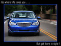
Get there in style!by vawendyComment: This a nice enough, well exposed shot, but there's nothing outstanding about it that would make me want to run out and buy this car. The text would indicate to me a drive out into the wilderness, but here they seem to be taking a drive down some suburban side street.
The framing of the car feels a little awkward, it's not quite filling the frame, but there's not really space either. I think for a shot like this it has to do one or the other. I find myself looking off to the right and running out of space before I find anything of interest there. Giving this a 5. |
 Photographer found comment helpful. Photographer found comment helpful. |
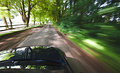
| 05/29/2009 07:56:58 PM |
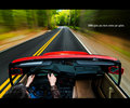
The Ultimate Driving Machine by bassboneComment: There is a lot about this I like. The location is great, I love the fact that despite all the motion blur you have that solid looking yellow line right down the middle leading away into the distance. The solid red colour of the car sits in nice contrast to the surroundings.
The text is just a tiny bit small for me, but it's far better that way than too large which it is in a lot of the others.
Overall, 8 from me. |
| Photographer found comment helpful. |
| 05/29/2009 07:50:53 PM |
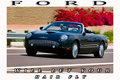
FORDby justineComment: Nice enough shot, but it doesn't "feel" like an auto ad. I'm not entirely sure why, I think it might be a combination of things.
Firstly I don't particularly like the text, this feels more like a postcard than an ad. Next is the very slight motion blur. You've done a great job of capturing the car but because the motion blur on the background is only very slight, it feels more like you did something wrong than it being something you were going for.
Lastly is the red bush thing in the background, it draws too much attention and doesn't leave the shiny black car to stand out on its own. Giving this a 5. |
| Photographer found comment helpful. |
| 05/27/2009 07:52:23 AM |
Girls in Trucks (soft in all the right places, tough in all the right ways)by pixelpigComment: ER is probably about the right response from me. I can only assume it's Chrysler because that's the only car brand I can think of that ends with ER. Not entirely sure what you're trying to sell me here, I could see the point if you were saying "Girls AND Trucks" but not "Girls IN Trucks".
The picture itself doesn't particularly prompt me to buy anything so I think as an ad it's not quite there. 3 from me. |
| Photographer found comment helpful. |
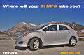
| 05/27/2009 07:41:52 AM |
2009 Toyota Matrixby CitadelComment: Good exposure and location, like the message you're putting across as well.
The shot seems a little flat though, it could be there there's a lot of grey in it and it all seems to blend together, but it just doesn't jump out the way you expect a car ad to do. 7 from me. |
| Photographer found comment helpful. |
| 05/27/2009 07:32:11 AM |
Jeep Wranglerby karenkComment: Very nice shot, it's a refreshing change from all the sleek shiny entries so far. Almost everything works here, the location, the mud all over the Jeep, the sky and the background. I say almost because I would have preferred to see it without the 2 guys, just the vehicle on it's own. 8 from me. |
| Photographer found comment helpful. |
| 05/27/2009 07:28:05 AM |
The Monster You Want To Wake You Up.by power47Comment: This would make a great ad for a bodyshop or parts place. The location and the fog in the headlights work very well, as well as the strong red from the lights. 9 from me. |
| Photographer found comment helpful. |
| 05/27/2009 07:18:32 AM |
Let BMW move youby bob_bobskiComment: Nice concept and good location, but it doesn't actually snow any of the car. If it wasn't for the title I wouldn't know what this was. |
| Photographer found comment helpful. |
| 05/27/2009 07:16:32 AM |
Out of the Darkness...by PiechProductionsComment: This is a good car ad, I've actually seen an Audi ad very similar to this one.
The setup and lighting are nice but the colours seem a little flat and almost cartoonish, not sure if it's a focus issue or something you've done in PP. 7 from me. |
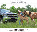
| 05/27/2009 07:10:49 AM |
Go ahead. Relax. by LydiaComment: I like the idea and message you are sending across here, and it does feel like a well targeted ad, but I don't like the actual composition.
There's just not enough of the car in it, and it's not like one of those ads where it's all dark and you catch little glimpses of what looks like a great car, you've actually just cut most of it out! |
| Photographer found comment helpful. |
Home -
Challenges -
Community -
League -
Photos -
Cameras -
Lenses -
Learn -
Help -
Terms of Use -
Privacy -
Top ^
DPChallenge, and website content and design, Copyright © 2001-2025 Challenging Technologies, LLC.
All digital photo copyrights belong to the photographers and may not be used without permission.
Current Server Time: 08/07/2025 10:30:36 PM EDT.