| Image |
Comment |
| 09/09/2009 12:12:12 AM |
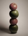
Stackedby mBastinComment by Yo_Spiff: I had thought this was an intentional desaturation. the other aspects of the photo were done well enough that I was pretty sure you meant it to be that way. I suspected the look would not go over well. I gave it a 6, however. |
 Photographer found comment helpful. Photographer found comment helpful. |
| 09/08/2009 01:01:23 PM |
Stackedby mBastinComment by Yo_Spiff: Not sure if the subdued color treatment will go over well with everyone. I'll be curious to see where this places. |
| Photographer found comment helpful. |
| 09/06/2009 11:31:51 AM |
|
| Photographer found comment helpful. |
| 09/05/2009 04:05:16 PM |
|
| Photographer found comment helpful. |
| 09/04/2009 02:54:51 PM |
Stackedby mBastinComment by kivgaen: It's very dark. With the red and green apples, were you going for this muted approach on purpose? I would have liked to see more intense or saturated colours and contrast between the reds and greens. I also think using the rule of thirds would have made this a more successful image (having the tower built on the right hand side, for example). |
| Photographer found comment helpful. |
| 09/03/2009 09:17:32 AM |
Stackedby mBastinComment by vawendy: It's very nice, but it also seems dark and for such colorful food, the colors are extremely muted. Did you try playing with levels and saturation? I making the colors more natural would help quite a bit. |
| Photographer found comment helpful. |
| 09/02/2009 10:07:14 PM |
Stackedby mBastinComment by LearnD: It's too gray, I'm sure you were going for something but it makes it dull and gloomy looking. Good idea although I think bright vibrant colours make fruit and veggie pictures more appealing. |
| Photographer found comment helpful. |
| 09/02/2009 07:28:02 PM |
|
| Photographer found comment helpful. |
| 09/02/2009 08:40:26 AM |
Stackedby mBastinComment by ineedauniquename: not sure about the colours, I think complete B&W would have worked better - red tomatoes are so cliched that slightly red looks washed out a bit. LIke the construction though |
| Photographer found comment helpful. |
| 08/27/2009 02:47:35 PM |
Curvesby mBastinComment by Ecce_Signum: Greetings from Andi via the Critique Club Mike and congratulations on a great score in your first challenge here!
First Impression: A well lit shot with some great contrasting curves. Sadly my eye is constantly drawn to the small shadow on the left most paper.
Composition: The shot nicely fills the frame and the idea to have opposing angles and an odd number of curves is excellent.
Subject: Yup, its pink so meets the challenge and whilst folded paper is becoming quite common here a well shot example is always pleasing to view so thanks!
Technical:Lovely pastel colours with the darker constradting right subject gives the shot the edge, lighting is almost perfect (that 1 shadow spoils it a little for me). Maybe if the 3 subjects were totally symmetrical the image might be improved slightly?
Final thoughts: Great choice for the challenge and in my book should have been a 6+ however you now have that joyous occaision to come ;) Good luck for future challenges! |
| Photographer found comment helpful. |
Home -
Challenges -
Community -
League -
Photos -
Cameras -
Lenses -
Learn -
Help -
Terms of Use -
Privacy -
Top ^
DPChallenge, and website content and design, Copyright © 2001-2026 Challenging Technologies, LLC.
All digital photo copyrights belong to the photographers and may not be used without permission.
Current Server Time: 07/16/2026 04:41:44 AM EDT.