| Author | Thread |
|
|
09/09/2009 12:31:56 AM |
Originally posted by Yo_Spiff:
I had thought this was an intentional desaturation. the other aspects of the photo were done well enough that I was pretty sure you meant it to be that way. I suspected the look would not go over well. I gave it a 6, however. |
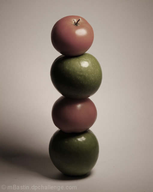
yeah i was unsure, i wanted it almost completely desaturated with a slght duotone, and my friend though it looked good saturated. so i thought i'd compromise and slightly desaturate it ( because that sounds like such a grat idea right? lol) i regreted it almost right after i submitted it but it was too late because I submitted it last minute.
Once i get a membership i'll upload the one i liked to do it justice because i like the picture, just not colour. thanks for the comments though. |
|
|
|
09/09/2009 12:12:12 AM |
|
I had thought this was an intentional desaturation. the other aspects of the photo were done well enough that I was pretty sure you meant it to be that way. I suspected the look would not go over well. I gave it a 6, however. |
|
 Photographer found comment helpful. Photographer found comment helpful. |
Comments Made During the Challenge  |
|
|
09/08/2009 01:01:23 PM |
|
Not sure if the subdued color treatment will go over well with everyone. I'll be curious to see where this places. |
|
| Photographer found comment helpful. |
|
|
09/06/2009 11:31:51 AM |
|
The photo seems to lack color. Maybe it's just my monitor? |
|
| Photographer found comment helpful. |
|
|
09/05/2009 04:05:16 PM |
|
The colors seem off to me, and overall a little oof. Nice compo, though. |
|
| Photographer found comment helpful. |
|
|
09/04/2009 02:54:51 PM |
|
It's very dark. With the red and green apples, were you going for this muted approach on purpose? I would have liked to see more intense or saturated colours and contrast between the reds and greens. I also think using the rule of thirds would have made this a more successful image (having the tower built on the right hand side, for example). |
|
| Photographer found comment helpful. |
|
|
09/03/2009 09:17:32 AM |
|
It's very nice, but it also seems dark and for such colorful food, the colors are extremely muted. Did you try playing with levels and saturation? I making the colors more natural would help quite a bit. |
|
| Photographer found comment helpful. |
|
|
09/02/2009 10:07:14 PM |
|
It's too gray, I'm sure you were going for something but it makes it dull and gloomy looking. Good idea although I think bright vibrant colours make fruit and veggie pictures more appealing. |
|
| Photographer found comment helpful. |
|
|
09/02/2009 07:28:02 PM |
|
| Photographer found comment helpful. |
|
|
09/02/2009 08:40:26 AM |
|
not sure about the colours, I think complete B&W would have worked better - red tomatoes are so cliched that slightly red looks washed out a bit. LIke the construction though |
|
| Photographer found comment helpful. |
Home -
Challenges -
Community -
League -
Photos -
Cameras -
Lenses -
Learn -
Help -
Terms of Use -
Privacy -
Top ^
DPChallenge, and website content and design, Copyright © 2001-2026 Challenging Technologies, LLC.
All digital photo copyrights belong to the photographers and may not be used without permission.
Current Server Time: 06/30/2026 08:50:22 AM EDT.