| Image |
Comment |
| 06/22/2005 03:57:38 PM |
|
 Photographer found comment helpful. Photographer found comment helpful. |
| 06/22/2005 03:56:32 PM |
LIGHTH_1.JPGby TooCoolComment by SJCarter: Beautiful sky & silhouette! I also think that a closer crop on the left would add to your (already great) image. Nice capture & very well done! The DOF is outstanding. |
| Photographer found comment helpful. |
| 06/22/2005 03:44:03 PM |
LIGHTH_2.JPGby TooCoolComment by inspir8tion: Great colors in this shot. The composition is great too. If I were to be incredibly picky I would remove the straight line of a cloud on the upper right-hand side. |
| Photographer found comment helpful. |
| 06/22/2005 05:05:34 AM |
LIGHTH_1.JPGby TooCoolComment by taterbug: Nice shot dude. The colors in the sky are just awesome. I really like the silhouette thing going on. I know it's not centered, but I feel a strong inclination to thinking that I wish the lighthouse were framed just a tad bit more to the left, not a lot. It may not be in it's actual placement within the frame, but perhaps because it seems like it's obscuring part of that magnificant sunset. Know what I mean? Maybe moving your pov a little left or probly even better, right? Kewl shot though. |
| Photographer found comment helpful. |
| 06/22/2005 01:51:21 AM |
LIGHTH_1.JPGby TooCoolComment by smilebig4me1x: what a wonderful and peaceful photo. looks as if the clouds themselves came from the lighthouse! great capture here |
| Photographer found comment helpful. |
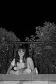
| 06/21/2005 11:22:58 PM |
Childhood Lostby TooCoolComment by dangerousdave: Doesn't demonstrate darkness. Maybe more granularity and the detatchment of the child from the teddy bear may have improved the effect. |
| Photographer found comment helpful. |
| 06/20/2005 10:53:05 PM |
Ian's Portraitby TooCoolComment by RonBeam: I do portraiture for a living. I think this is a fine, revealing portrait with your own feelings for your subject folded into the image. This is always the goal of a good portrait photographer. The element of the tractor is a great linking tool. I probably would have cut cropped this to diminish the hunched over posture. I would bring the right border to about where the long vertical fold in his shirt is located. This slims the subject and also gives him more room forward than behind, symbolizing the future. The top could come down a tiny bit in order to create a more intimate frame. Nice work .. first portrait? Wow... could be your calling! |
| Photographer found comment helpful. |
| 06/20/2005 11:00:22 AM |
Ian's Portraitby TooCoolComment by twm122: I really like it. Looks like a John deer to me. I think if you had used a ladder or something to make you higher so that he looks slightly up. It might have reduced the appearance of a second chin. Nice use of flash for fill light. Overall, I like it though, give you a sense of who he is and what he does. Telling a brief story about him. |
| Photographer found comment helpful. |
| 06/20/2005 09:57:42 AM |
Childhood Lostby TooCoolComment by Artifacts: Excellent clarity in the fine detail and a good capture of the child's expression. Great tones and B&W works well in this situation.
Most voters will likely "get it" but some may just think it is another kid picture.
You might consider cropping it closer on the child to highlight her. She is the main subject and much that is around her adds little to the composition.
Looks like the lines of the bricks and the top of the fence are slightly off horizontal by a third to a half a degree. In that situation you should rotate the image to make them perfectly level. |
| Photographer found comment helpful. |
| 06/17/2005 11:42:41 PM |
|
| Photographer found comment helpful. |
Home -
Challenges -
Community -
League -
Photos -
Cameras -
Lenses -
Learn -
Help -
Terms of Use -
Privacy -
Top ^
DPChallenge, and website content and design, Copyright © 2001-2026 Challenging Technologies, LLC.
All digital photo copyrights belong to the photographers and may not be used without permission.
Current Server Time: 06/09/2026 10:45:12 PM EDT.