| Image |
Comment |
| 08/20/2006 05:21:24 PM |
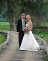
Shawn-N-Eldon.jpgby TooCoolComment by jpochard: I like the placement of the couple within the setting, and the overall pose. I would have had him turn in toward the bride a little more. For some reason, the faces seen a bit out of focus to me. Could be the distance. The details just don't seem crisp, but that could easily be more from the web resizing.
The light is a little flat and I would warm up the tones just a tiny bit. That's a great spot to catch one with them looking at each other as well.
I like the shot very much, and see only those few places for improvement.
|
 Photographer found comment helpful. Photographer found comment helpful. |
| 08/20/2006 04:57:32 PM |
Shawn-N-Eldon.jpgby TooCoolComment by philup: Originally posted by tjbel05:
Im certainly no expert by any means. I love the over all composition of this photo. The only thing I might change is a slight crop to bring them in just a little closer. Thats just a personal preference of mine, does not make it right or wrong. Great Job, Congrats. |
Thinking the same! Great shot |
| Photographer found comment helpful. |
| 08/20/2006 04:55:55 PM |
Shawn-N-Eldon.jpgby TooCoolComment by tjbel05: Im certainly no expert by any means. I love the over all composition of this photo. The only thing I might change is a slight crop to bring them in just a little closer. Thats just a personal preference of mine, does not make it right or wrong. Great Job, Congrats. |
| Photographer found comment helpful. |
| 08/20/2006 04:24:02 PM |
Shawn-N-Eldon.jpgby TooCoolComment by dwterry: What is working well here are:
- The pathway lines on the left and right of the couple and how the curve stops right where they are.
- The tree to the left of them.
- The bride being on the right. (had she been on the left, the lines would not have worked so well)
- Her pose with her head tipped towards the groom forming an S-shape with her body
Areas for improvement:
- His left hand is sneaking out behind her, underneath her elbow.
- His stance is a little stiff. (mostly forgiven because I think everyone is more likely to look at her than at him!)
- Where the natural light was fairly flat, a little dodge & burn could add some emphasis to the picture. |
| Photographer found comment helpful. |
| 08/17/2006 04:31:20 PM |
SarahNJoe-Jonesby TooCoolComment by Sarah90886: Ron this is the best photo i would have to say i ever seen of yours the girl in it is absolutly beutiful....And the guy well he shouldnt be in it..lol Great pic |
| Photographer found comment helpful. |
| 08/10/2006 09:43:05 PM |
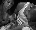
Ghetto Tattooby TooCoolComment by jrtodd: Ron,
This is a good photograph but more over I think it fits the scheme of Jones Soda well. I do feel you could have had a bit more DOF to pick up the girl but still very nice. Good luck with the contest, casted my vote! |
| Photographer found comment helpful. |
| 08/09/2006 11:52:39 PM |
|
| Photographer found comment helpful. |
| 08/06/2006 11:11:47 PM |
|
| Photographer found comment helpful. |
| 08/04/2006 11:43:55 PM |
Lilyby TooCoolComment by Melethia: A bit too harsh to say "zen" to me, though it is very minimalistic and the colors and crispness are good. |
| Photographer found comment helpful. |
| 08/04/2006 03:28:28 PM |
Lilyby TooCoolComment by jjstager2: Background a little too bright for me. Beautiful colors - glad you included the green of the stem. |
| Photographer found comment helpful. |
Home -
Challenges -
Community -
League -
Photos -
Cameras -
Lenses -
Learn -
Help -
Terms of Use -
Privacy -
Top ^
DPChallenge, and website content and design, Copyright © 2001-2026 Challenging Technologies, LLC.
All digital photo copyrights belong to the photographers and may not be used without permission.
Current Server Time: 07/16/2026 03:09:27 PM EDT.