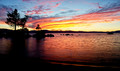
Zephyr Cove ~ Lake Tahoeby
Ja-9Comment by JamesDowning: Greetings from the Critique Club.
By your score and placement, obviously this is a successful image. I think it blends a great scene, and a great sunset, and rolls in some emotion. I think often emotion is difficult to get from a non-human image, but this one does so. What person wouldn't want to be sitting on that beach and enjoying that wonderful view and sunset. Looks to be the perfect setting.
Color-wise, I think you successfully popped the orange and yellows of the sunset. I think I might have tried to increase the vibrancy of the blue though. A really great sunset in my opinion has a wonderful blue sky, which contrasts well with the orange and yellows of the illuminated clouds. A little burning might have done you well on the brightest area of the clouds too, but I'm not entirely sure it's necessary.
Cloud-wise, part of me wants to walk up the beach, to the right, a little more in order to capture a little more of the swirled cloud. As is, it leads in well to the trees, but it's also in conflict with them. A little more separation might have worked even better for you, that way you could have a wonderful division of light and dark. Sky and silhouette.
For landscapes, I've also found that a taller crop can sometimes lead a viewer to spend more time on your photo. I think it's mainly because it results in more visual space for the eye to get lost in. With my hands, I played with different crops on your image, and I think cropping off the right 20-25% of the image could have been an even stronger composition. That way the division between light and dark would be nearly central. I understand why you stuck it at 1/3, but the middle crop seems stronger to me. It emphasizes both the trees and the sunset more evenly, and basically gives your image 4 quadrants.
Looking through your editing steps, I see that you adjusted sharpness prior to resizing the image. Now, I'm no pro at editing, but I personally think the sharpening at that level does not affect the final outcome of the 800 px size. I tend to do all of my sharpening after the final resize, as that's what really counts to the viewer. I am not familiar with PSE10, but on CS5 I use the smart sharpen filter. Set the radius to 0.6 to 0.4 px, and it can be used to finely adjust the sharpness of your final image. It helps a good bit, because no matter what, you will get some automatic smoothing whenever you downsize, although it honestly doesn't look too bad. Anyways, it's something to experiment with because for the longest time I had wondered how some members could get such amazing clarity of details on their images. Again, a great image and a pleasure to look at. It makes me want to go visit the lake!
Food for thought.
James Downing