Always Look Behind You....by
Ja-9Comment by JakeKurdsjuk: Critique Club:
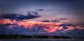
Ah, Janine, another beautiful Florida sky, eh? Looking forward to seeing them in a couple days.
I noticed you said that this is your first foray into HDR Pro 2, so I'll keep that in mind. It's definitely a lovely sky and one worth showing. Unfortunately the final result is over treated, as you probably realized from the "Pulled my hair out" step. It's a great vista, but the composition is a little rough with the slightly skewed horizon and a lot of open space at the top. I'm wondering if a different crop, either tighter or adding more water at the bottom, would have balanced it better? Then again, it's a skyscape and some folks might have thought that it shouldn't even have the water?
Regardless, I think where this didn't quite cut it (because it's a wonderful skyscape) is in the processing, which is why you've got the heavy midrange in the voting.
First, and most controllable, I think this also suffers from something I've begun to see on a lot of images - there's a false darkening (on my monitor at least) from being displayed against this light background. When I open the image location on its own and it appears against a medium-dark gray, what I perceive here to be over-vignetting isn't the case at all. I know the default PS background is about the same color dark gray, so I've started displaying the final image against a light gray first before completing the edit (right-click in the open area and choose the light gray open instead of default and then put it back when you're done).
As an HDR Efex Pro user I can tell you that the rest of your processing issues started there. How many images did you merge, or did you just send this in as a single image? I will give you a tip, outside of doing noise reduction (use Dfine 2.0
first on everything that's not in native ISO - it's an amazing part of the Nik package, but it cannot save the noise introduced by some of the other filters - been there, done that), basic levels adjustment and possibly White Balance, do not make any other changes to your image(s) before sending them to HDR Efex as it will amplify everything. Also, if you have a single image you want to tone map, instead, create 2 virtual copies in Lightroom and set the exposure on one to -2EV and the other to +2EV and then send the three of them into the HDR Merge process. The program will act slightly differently even though it technically has the same light information.
So, what happened? It looks like you went for some sky pop in the HDR module, and while it likely give you some great textures and colors it also gave you some halos on the horizon and the noise in the sky that comes naturally from some of the settings, giving it an over-baked look. Use control points to tone down some of the structure effects in areas that have no textures, so all you get is noise.
From there I'm guessing that you simply put in a valiant effort to save what HDR Efex left you with. It's a really lovely skyscape, and well capture, but just mishandled a bit.