| Image |
Comment |
| 07/20/2003 03:42:06 PM |
Uh Oh !by kopa21Comment by OneSweetSin: *Critique Club*
What a cute photo. I know you already know about resizing and how this one was just to small.
Your focus is really good and the lighting is a little to dark, but easily fixed.
Overall I would tend to agree it leaves a few questions and I can hear the child saying uh oh myself.
Anna
|
 Photographer found comment helpful. Photographer found comment helpful. |
| 07/20/2003 10:09:23 AM |
|
| Photographer found comment helpful. |
| 07/20/2003 12:12:58 AM |
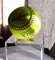
Game Ballby kopa21Comment by Firstrich1: way to much going on around this shot. the glare and shadow on the ball also takes away from any good focal point. |
| 07/18/2003 10:12:13 AM |
|
| Photographer found comment helpful. |
| 07/17/2003 05:32:14 PM |
Game Ballby kopa21Comment by pottersclay75: Love the color.. lighting is harsh, and you might consider using backgrounds or backdrops for such subjects. |
| Photographer found comment helpful. |
| 07/16/2003 10:08:49 AM |
Game Ballby kopa21Comment by Everyday Renee: The shadowing appears dark to me on the top of the ball. It is distracting. You want to move it to see it better. |
| 07/16/2003 03:03:10 AM |
|
| 07/16/2003 02:21:44 AM |
Game Ballby kopa21Comment by brettd: The sharpness and detail are great, but I would have liked to see it with a more interesting backdrop, and more even lighting. |
| Photographer found comment helpful. |
| 07/16/2003 12:23:48 AM |
Game Ballby kopa21Comment by RiderGal: The window in the back is rather distracting... I like the way the light falls on the wording though, it makes whatever it says seem all that more intriguing. I think I would have rather had this in a studio setting, or at least with a solid background. The papers that are underneath it are kind of bothersome as well. |
| Photographer found comment helpful. |
| 07/12/2003 07:28:06 PM |
Uh Oh !by kopa21Comment by orussell: I was looking through some of the user profiles today and I came across this picture. At the time I didn't make the connection but I knew it looked familiar. When I started doing some comments it hit me but I couldn't remember who you were to let you know it was visible for all to see. Once you see this I'm sure you will remove it anyways. Cute kid. |
| Photographer found comment helpful. |
Home -
Challenges -
Community -
League -
Photos -
Cameras -
Lenses -
Learn -
Help -
Terms of Use -
Privacy -
Top ^
DPChallenge, and website content and design, Copyright © 2001-2026 Challenging Technologies, LLC.
All digital photo copyrights belong to the photographers and may not be used without permission.
Current Server Time: 07/16/2026 12:16:25 AM EDT.