|
|
| Image |
Comment |
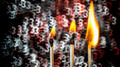
| 02/12/2015 11:48:47 PM | Trinityby OK-PhotographyComment by Neat: Sometimes less is more, I like the idea but maybe the matches didn't need to be there. |
| 02/12/2015 12:25:58 PM | |  Photographer found comment helpful. Photographer found comment helpful. |
| 02/11/2015 05:29:30 PM | | | Photographer found comment helpful. |
| 02/11/2015 03:45:25 PM | |
| 12/03/2014 04:25:56 PM | Hellfireby OK-PhotographyComment by OK-Photography: Originally posted by CBalck:
This image just doesn't say "Macro" to me, it could be that I don't have a point of reference on the scale. It is a cool image and I love the sparks though, so I'm giving you a vote even though it is creeping close to the "does not meet challenge" voting criteria. A 6 from me. |
nevertheless, this is my best-rated shot so far, got a 15th place!!!
but yeah, it's NOT REALLY a macro-shot for me too, totally agreeing on that point! ;) |
| 11/25/2014 08:50:10 PM | Hellfireby OK-PhotographyComment by MadMan2k: Nice - perfectly exposed and cool effect, I like the color variation between the blue flame and orange sparks. |
| 11/21/2014 05:17:44 PM | Hellfireby OK-PhotographyComment by Catherine_B: This image just doesn't say "Macro" to me, it could be that I don't have a point of reference on the scale. It is a cool image and I love the sparks though, so I'm giving you a vote even though it is creeping close to the "does not meet challenge" voting criteria. A 6 from me. | | Photographer found comment helpful. |
| 11/21/2014 11:51:32 AM | |
| 09/28/2014 07:43:49 PM | Square Leafby OK-PhotographyComment by Garry: Hi, welcome from the Critique Club!!
For this challenge, you submitted a really beautiful leaf with lots of good character and detail! I think that the obvious shortcoming of the image is, as the other comments allude, that there really are no obvious right angles...which is what the challenge was about. Had the veins in the leaf been at the right angle, I suspect your image would have done so much better!
Subject aside, I feel the image is a little to over-processed. The colors are too saturated for my liking, and come across as unnatural. The background is this odd color (pinky-yellow) which is not quite complimentary either. I know you mention this is a contre-jour image, which sometimes works and sometimes doesn't. I certainly feel the latter is the case here, as the backlighting doesn't really contribute anything to the shot. Perhaps choosing a leaf on a background with more color (red/green/blue) could've given you a little more pop?
All in all, I think you received a fair score for the image. As a new member to DPC, I would certainly encourage you to try meet the challenge topic a little more clearly in future as the DPC voters are sometimes a literal bunch and don't like variations/different interpretations on the challenge theme.
Hope this critique has helped. Feel free to PM me if you'd like to discuss any of it further!
Kind regards,
Garry
|
| 09/20/2014 03:29:15 PM | Centerlockby OK-PhotographyComment by snaffles: Greetings from the Critique Club!
I can see where you were headed here, and as an abstract macro it's fun to look at and figure out what's going on. However in a shadows challenge, it just won't cut it. The composition and lighting are ok (and your shoot notes made me laugh, I've often used similar home-brewed setups in the past). I think you could have taken this idea a little further and kept in mind that shadows (the more obvious the better) are what goes over well here.
Hope this critique has been useful, feel free to PM me with any questions.
Susan |
Home -
Challenges -
Community -
League -
Photos -
Cameras -
Lenses -
Learn -
Help -
Terms of Use -
Privacy -
Top ^
DPChallenge, and website content and design, Copyright © 2001-2026 Challenging Technologies, LLC.
All digital photo copyrights belong to the photographers and may not be used without permission.
Current Server Time: 07/16/2026 04:57:10 PM EDT.
|