Hi my name is Stone Face, what is yours?by
JohannesFrankComment by L1: Howdy from the Critique Club! :o)
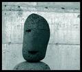
You placed quite nicely in the Hidden Faces challenge with this image, so there isn't a whole lot for me to say that you haven't already read from other commenters. I'll briefly touch on four aspects with my random thoughts...composition, technical details, relationship to challenge, and aesthetics.
1. Composition: I quite like the off-center composition. Many find a centered composition to be too static, and I am one of those people. I do have one little nitpick, in that I would have preferred to see it composed more on the right side than the left, as that "eye" is missing and I would like more lead room on the left where his good "eye" might be seeing or something, but that is just me. The lines in the background are not completely on the horizontal, so I might suggest a slight rotation and cropping, or the use of one of the transform tools in Photoshop (skew, perspective, etc) to pull it to a level horizon.
2. Technical details: Your focus is sharp, your processing technique is nice, exposure is good (a slight glare in tiny spots on the background...appears that the paint is rather reflective or something), and lighting is nice. Some commented that more light would be more effective, which is true. Or perhaps some dodging across the little guy. Some way to highlight him against the background.
3. Relationship to challenge: You hit this one head-on (no pun intended). Excellent find and perfect for this challenge.
4. Aesthetics: It is a visually interesting and pleasing subject for the challenge. Some might be a bit put off by the lime green color, but it seems to work well. I might have gone with a cooler grey, sepia, or blue to emphasize the stone, but that's no biggie.
Overall, it's a very strong image with good points and points upon which improvements could be made. Best of luck in future challenges, and if you have any questions, please feel free to PM me! :o)
Laurie
Critique Club