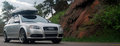
Audi: Coloradoby
SoulComment by salmiakki: Greetings from the Critique Club
Looking at the comments below, I see that you have not marked some as helpful. That is very interesting because instead of the normal one or two words, at least two of those comments are extremely helpful as they are explaining to you why you like only scored a 5.00. I am likely to repeat most of what they said in my critique.
The composition is good, you have the car driving into the frame which works well. The choice to use a sort of letterbox crop is interesting and I'm not 100% sure that this works that well. I think I would prefer to see a little more vertical height above the roof of the car.
The focus seems a bit off, the rocks to the right of the frame are sharp but the car is not that sharp (it doesn't really look like motion blur). Also, the image feels a bit flat with regard to the lighting. A boost in levels would likely have helped a bit here, as it seems a bit underexposed.
As this was an advanced editing challenge, you could have selected the car and adjusted the levels (midtones) specifically for the car and then inverted the selection and boosted the rest of the image (highlights). I feel sure this would have helped.
As this was a automobile ad, I think you would have really helped your score by adding some text/graphics to the image. Most of the higher scoring images had texts added.
I was surprised this didn't score higher. It is a good image that could benefit from a bit more advanced editing. Hopefully you understand a bit better now why it only scored a 5.00.