| Image |
Comment |
| 03/08/2012 01:26:46 AM |
_MG_5799colorby ScooterMcNuttyComment by aliqui: Hate to say it, but I much prefer the colored version. You've got some gentle freckles going on there that I couldn't see in the black and white. Very sweet. |
 Photographer found comment helpful. Photographer found comment helpful. |
| 03/08/2012 01:06:33 AM |
Untitledby ScooterMcNuttyComment by aliqui: A lensbaby self portrait?? I have a hard enough time shooting a fence with that darn thing. The eyes are dead on. As mentioned below, your cheek got blown out a little. My eyes go directly to the white on the right of the image and then to your cheek. |
| Photographer found comment helpful. |
| 03/07/2012 03:05:23 PM |
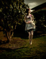
Gazeby ScooterMcNuttyComment by Denielle: Love the processing in this photo. The capture is great... it looks like she is floating through the air. Nice lighting as well. Beautifully executed! |
| Photographer found comment helpful. |
| 03/07/2012 03:00:36 PM |
Gazeby ScooterMcNuttyComment by JamesDowning: Nice lighting and composition, but I'm not a fan of the color tones. Looks like some sort of HDR coloring was used? I don't think the effect helps the image. |
| Photographer found comment helpful. |
| 03/07/2012 02:11:14 PM |
|
| Photographer found comment helpful. |
| 03/07/2012 01:04:40 PM |
|
| Photographer found comment helpful. |
| 03/07/2012 01:04:09 AM |
|
| Photographer found comment helpful. |
| 03/06/2012 11:40:28 AM |
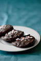
Peppermint Pattiesby ScooterMcNuttyComment by snaffles: Greetings from the Critique Club!
Ah feel yer pain...I see no reason why this gorgeous shot placed so low, I thought top 10 for sure. The comp is good, the focus is tack sharp, the complimentary colours are perfect for each other, and more to the point this shot made me want to gobble them down, which is why I gave you a 7 in voting! :-)
Maybe voters wanted to see the leading edge of the plate more in focus, who knows. But I do feel that there is just too much b/g and not much else floating around above the plate so a tighter crop is what I'd like to see. A shot like this needs more atmosphere, maybe if the fg looked like a tablecloth and in the bg was the hint of a kitchen or a kid's party, something like that, just to give it that little bit more atmosphere.
FWIW you may want to look at www.lcbo.ca (I think, it may be a .com addie). The two main photogs, James Tse and another guy whose name I don't recall offhand, specialise in food closeup shots like this that also have a sense of place to them.
Feel free to PM me,
Susan |
| Photographer found comment helpful. |
| 03/06/2012 10:38:46 AM |
|
| Photographer found comment helpful. |
| 03/06/2012 08:05:40 AM |
|
| Photographer found comment helpful. |
Home -
Challenges -
Community -
League -
Photos -
Cameras -
Lenses -
Learn -
Help -
Terms of Use -
Privacy -
Top ^
DPChallenge, and website content and design, Copyright © 2001-2026 Challenging Technologies, LLC.
All digital photo copyrights belong to the photographers and may not be used without permission.
Current Server Time: 06/19/2026 08:18:28 AM EDT.