|
|
|
Showing 311 - 320 of ~722 |
| Image |
Comment |
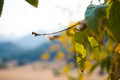
| 12/04/2008 08:33:21 AM | Tribute to Uta Barth "Ground 95.6"by zackdezonComment by bobonacus: No offence but I think I prefer the original one having googled it. The cropped leaves at the top left are a little bit of a distraction and I think the twig through the middle would be better if it was in focus |  Photographer found comment helpful. Photographer found comment helpful. |
| 12/02/2008 09:51:04 PM | | | Photographer found comment helpful. |
| 12/01/2008 08:13:39 PM | | | Photographer found comment helpful. |
| 12/01/2008 03:42:54 AM | | | Photographer found comment helpful. |
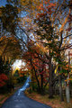
| 11/14/2008 07:35:52 PM | Forest Pathby zackdezonComment by chromeydome: Technicals, Aesthetics, etc.. Thread
This is well seen, well composed, and a lovely image. I gave it a 6 in voting.
The viewer's eye tends, in general, to be drawn to the brightest portion of the image (though not specular highlights). Care must be taken, then, to guide the viewer's eye where you want them to look. In this image, the very hot spot in the distance under the arch of trees and above the road draws the eye to it, a blank area, and away from the most interesting parts of the scene. A little burn here would serve the image well, I think. The right edge of the image could do with a bit of burn or vignette--very slight. The leaves and the road should be the primary elements here, and anything that distracts should be addressed. To be (excessively) nitpicky: the road marker neon orange bits compete with the leaves.
The composition choices, leading lines, and the road placement are very nicely done. The sense of luminous, warm light on the trees, and cool blue in the shade is well done.
| | Photographer found comment helpful. |
| 11/13/2008 09:30:54 PM | Forest Pathby zackdezonComment by yanko: The focal point is in a very desirable part of the frame and conforms with the rule of thirds. However that focus is of the patch of sky and not the road itself or the trees, which leaves me somewhat perpexed especially given the title. Had the patch of sky held some meaning or otherwise deserved the attention, my feelings would be different. That said, this isn't a bad photograph at all. There's a lot to like after you get past the initial entry point. For example, the prominence the trees are given feels appropriate given their real life scale yet the way they maintain that real estate is that of a protector and not an aggressor. The small path in the left corner seems to occupy that limited space free from the threat of intrusion.
Technicals, Aesthetics, etc.. ThreadMessage edited by author 2008-11-13 21:31:18. | | Photographer found comment helpful. |
| 11/13/2008 08:28:36 PM | Forest Pathby zackdezonComment by posthumous: Every picture must carry within it the answer to the question, "Why should I look at this?" In this case, it is a matter of esthetic pleasure. The content is empty: a simple road that runs into the distance, which isn't very far. If this were a painting, I could talk about brush strokes and how they are used to create the illusion of reality. As a photographer, you don't have this advantage. The illusion of reality was created for you. Therefore, the questions become: what angle have you taken on this reality? and how have you post-processed this reality? Often this puts the photographer in the opposite role of the traditional artist. Instead of creating an illusion of reality, the photographer is undermining an illusion of reality.
On the face of it, you appear to have done very little. It looks like you stood comfortably in the middle of the road and snapped a picture. Then you did a minimal amount of processing to bring out the colors and contrast. At least, that's how I interpret your own comments. However, in spite of all that, this is one of the best pictures of the 6 offered. Why? Because of compositional considerations: the light plays throughout the image, piercing through the branch detail on the top and dripping down the road like wet paint. It curves around shadowed areas in a pleasingly balanced but surprising and energetic way. The photo is not memorable, but it is pleasing to look at.
Now, if one of the purposes of this exercise is improvement, we have to ask how does one make a photo memorable? There are as many ways as there are photographers and photographs. One consideration that seems to work through all the arts is to have form and content work together. A composition, for example, can be static or dynamic, chaotic or orderly, balanced or off-balance, etc. These qualities can create a mood. That mood can complement or contrast with the subject matter. And by the way, none of this is about scoring well at DPC. Look at my portfolio to know that I have no business pontificating on that subject!
Technicals, Aesthetics, etc.. Thread | | Photographer found comment helpful. |
| 11/13/2008 08:02:13 PM | Forest Pathby zackdezonComment by Nocturnal_Delusion: This image had a lot going for it, composition is strong with leading lines on thirds, I think it may have been slightly more aesthetically pleasing if you took a couple steps to the left making the path's destination more visible but otherwise very well composed. The sky is very bright and there's only some dappled light on the tops of some trees, the foreground is all in shadow so it doesn't have a very wide tonal range, some cloud cover really could have helped this image. I really like the color pallette, had I voted in this challenge I would have scored this a 5.
Technicals, Aesthetics, etc.. Thread
| | Photographer found comment helpful. |
| 11/02/2008 04:24:02 PM | | | Photographer found comment helpful. |
| 11/02/2008 01:26:26 PM | | | Photographer found comment helpful. |
|
Showing 311 - 320 of ~722 |
Home -
Challenges -
Community -
League -
Photos -
Cameras -
Lenses -
Learn -
Help -
Terms of Use -
Privacy -
Top ^
DPChallenge, and website content and design, Copyright © 2001-2026 Challenging Technologies, LLC.
All digital photo copyrights belong to the photographers and may not be used without permission.
Current Server Time: 07/27/2026 09:34:03 AM EDT.
|