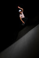
DPChallenge: A Digital Photography Contest You are not logged in. (log in or register
 
Browse Settings
Currently viewing:
Registered Userstantheman1313

Show comments:

Per page:

Order:

Comments:


Comments Received by stantheman1313
Pages:   ... ...
Showing 171 - 180 of ~414
Image Comment
Rain
04/20/2011 09:35:02 AM
Rain
by stantheman1313

Comment by Virginia Leone:
I like this but not in keeping with the theme challenge.
Rain
04/20/2011 12:56:58 AM
Rain
by stantheman1313

Comment by JuliBoc:
I like your image, but I'm not seeing an empty room. Looks like someone standing in front of a blackboard. I would guess there are a lot of desks and/or chairs in there.
Inline
04/18/2011 04:33:55 AM
Inline
by stantheman1313

Comment by Paul:
Greetings from the Critique Club:

This is strong work and for my money the lighting is perfect. Great isolation of subject with due inclusion of that tilted reference plane too - that, by the way is sublimely lit.

Overall composition is very effective and Of course the 1/160 flash sync speed masks a much quicker light source, this has frozen the movement fantastically. The timing of the shot too is highly effective with plenty of air.

Overall, you've left me with little to critique. I'm not sure I'd change a thing.

Paul

Message edited by author 2011-04-18 04:52:01.
Photographer found comment helpful.
Temptation
04/17/2011 08:35:32 AM
Temptation
by stantheman1313

Comment by salmiakki:
Greetings from the Critique Club

Congrats on the top 20 slot in this challenge.

I think the idea of this is excellent. There's a lot to like about it. I do actually like the horizontal orientation, it's not what one might expect. I noted your comment about the pimple, that is something that the eye is drawn to.

I wonder whether this is ever so slightly underexposed? I somehow feel like the body should be a tiny bit brighter (ok, that's just me nit picking.)

The one thing I would change is the border. Several of your commenters have mentioned it and it bothers me too. I'm not entirely sure how I would feel if it were borderless, but somehow this border really gives the feeling that you have chopped the legs & head off. The use of borders is such a personal thing, but if you belong in the don't like camp, then the score can really take a bit of a hit. I typically like a subtle border, but in this case, I think this would benefit from not having a border.

Overall a very well done image that completely meets the challenge.
Sarah

Temptation
04/13/2011 11:51:45 AM
Temptation
by stantheman1313

Comment by Adz:
Congrats on the finish, you should be proud - great shot!
Photographer found comment helpful.
Temptation
04/13/2011 01:03:41 AM
Temptation
by stantheman1313

Comment by stantheman1313:
by "border kills this one." do you mean in a good way or bad way?
oldbimmercoupe

Message edited by author 2011-04-13 12:32:33.
Inline
04/12/2011 12:14:03 PM
Inline
by stantheman1313

Comment by onepurplerose:
Nice composition and lighting! Good idea.
Photographer found comment helpful.
Temptation
04/12/2011 09:08:22 AM
Temptation
by stantheman1313

Comment by hicks:
Great shot, lovely lighting. Well done.
Photographer found comment helpful.
Temptation
04/12/2011 05:36:38 AM
Temptation
by stantheman1313

Comment by RamblinR:
Always good to have something a bit different and I think this works well.
Photographer found comment helpful.
Temptation
04/11/2011 07:19:47 PM
Temptation
by stantheman1313

Comment by oldbimmercoupe:
border kills this one.
Pages:   ... ...
Showing 171 - 180 of ~414


Home - Challenges - Community - League - Photos - Cameras - Lenses - Learn - Help - Terms of Use - Privacy - Top ^
DPChallenge, and website content and design, Copyright © 2001-2025 Challenging Technologies, LLC.
All digital photo copyrights belong to the photographers and may not be used without permission.
Current Server Time: 08/04/2025 08:12:07 PM EDT.