| Image |
Comment |
| 06/12/2011 02:16:58 PM |
Barrenby stantheman1313Comment by mariuca: The color palette diminishes a bit in my view the intention of this shot. Perhaps a B&W would be beneficial. |
 Photographer found comment helpful. Photographer found comment helpful. |
| 06/12/2011 06:59:48 AM |
|
| 06/11/2011 10:59:38 AM |
|
| Photographer found comment helpful. |
| 06/10/2011 11:42:16 AM |
|
| Photographer found comment helpful. |
| 06/10/2011 10:42:35 AM |
|
| 06/10/2011 10:09:27 AM |
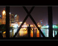
CIty Lightsby stantheman1313Comment by giantmike: Interesting choice of composition. The letter box style is really messing with my mind. It's making me want to see more into this photo.
Also, I think a quick DeNoise could have really helped clean this up. |
| Photographer found comment helpful. |
| 06/10/2011 01:42:35 AM |
CIty Lightsby stantheman1313Comment by jamesgoss: I like the composition, very strong lines, and interesting points on all the 3rds. I also enjoy the strong horizontal nature of the shot, but I don't think that the huge black borders or the large white stripes add to the shot. |
| Photographer found comment helpful. |
| 06/08/2011 11:53:55 AM |
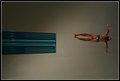
Barrenby stantheman1313Comment by EL-ROI: The blown out sky at the end leaves me wanting more. The field has the golden sunkiss of evening light, yet the eye travels to that blank, white sky.
eta: I just came back to visit this and rethought the picture. If I evaluated the picture for leading lines only, the white sky would act as a stopping point. But as a representation of minimalist art, I can break it down into it's fundamental parts a little more... red field with vertical lines, thin strip of landscape, white horizontal sky. I can bump up my score a bit for that. |
| Photographer found comment helpful. |
| 06/02/2011 12:32:10 AM |
Soar by stantheman1313Comment by levyj413: This is absolutely spectacular! Inspires me to get out this summer at our local pool and shoot the dive team. |
| Photographer found comment helpful. |
| 05/18/2011 07:37:01 AM |
Mouse Holeby stantheman1313Comment by scottbrooks: I loved the idea. I wonder whether it would have been stronger with different positioning of the face/eye and the light (so the nose didn't cast a dark shadow into the eye socket). Voted 8 and really think it should have done better. |
| Photographer found comment helpful. |
Home -
Challenges -
Community -
League -
Photos -
Cameras -
Lenses -
Learn -
Help -
Terms of Use -
Privacy -
Top ^
DPChallenge, and website content and design, Copyright © 2001-2026 Challenging Technologies, LLC.
All digital photo copyrights belong to the photographers and may not be used without permission.
Current Server Time: 07/26/2026 01:10:27 PM EDT.