| Image |
Comment |
| 07/23/2003 11:10:55 PM |
|
| 07/23/2003 11:04:30 PM |
|
| 07/23/2003 01:44:44 PM |
Tieby RobinkaComment by Fayech: the lighting is too direct and washes out the colors. would be a nicer if more care was taken in arranging the tie. seems haphazard. |
 Photographer found comment helpful. Photographer found comment helpful. |
| 07/23/2003 04:04:20 AM |
|
| 07/23/2003 12:59:05 AM |
Tieby RobinkaComment by Spanish_Grease: Nice idea. I think it might have been much more effective in b&w though, but all I know you tried that and it didn't look right! |
| Photographer found comment helpful. |
| 07/22/2003 01:37:31 PM |
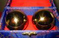
Golden ballsby RobinkaComment by adine: Nice subject. Wish they were in a more interesting setting, perhaps one that takes advantage of their reflective ability. Perhaps a crop that makes the box less obvious. |
| 07/22/2003 08:51:03 AM |
Golden ballsby RobinkaComment by banmorn: Like the round against the rectangle....I would have emphasized, perhaps, the round reflections of the box on the balls and lost the lid all together. The lid, even a hint of it distracts me. Do not like the hot spots on the balls. |
| Photographer found comment helpful. |
| 07/17/2003 05:34:29 PM |
|
| Photographer found comment helpful. |
| 07/16/2003 01:29:30 PM |
|
| 07/15/2003 09:28:07 PM |
|
Home -
Challenges -
Community -
League -
Photos -
Cameras -
Lenses -
Learn -
Help -
Terms of Use -
Privacy -
Top ^
DPChallenge, and website content and design, Copyright © 2001-2026 Challenging Technologies, LLC.
All digital photo copyrights belong to the photographers and may not be used without permission.
Current Server Time: 07/15/2026 04:18:51 PM EDT.