| Image |
Comment |
| 05/01/2008 10:31:50 AM |
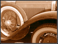
1930by fldaveComment by albc28: I'm not a big fan of the composition. Both of the tires should have been completely in the photo but they are instead both cut off. |
 Photographer found comment helpful. Photographer found comment helpful. |
| 04/30/2008 05:01:22 PM |
1930by fldaveComment by timwest167: I like the old-time feel to this. Could do with a little more contrast though... |
| Photographer found comment helpful. |
| 04/30/2008 06:09:25 AM |
1930by fldaveComment by SaraR: Good composition, and a really interesting range of shapes. |
| Photographer found comment helpful. |
| 04/29/2008 02:38:45 PM |
|
| Photographer found comment helpful. |
| 04/29/2008 11:14:24 AM |
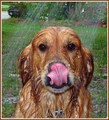
Dog Washby fldaveComment by JulietNN: I gave this one a 9. It makes me chuckle every time I see it. My kids all went AWWWWWWWWWWWWWWWWWWWWWWWWWWWW when they saw it and have tried to do the same with my dogs now and they are so not happy.!! I now have a wet dog smell in the house! |
| Photographer found comment helpful. |
| 04/29/2008 11:13:09 AM |
Not Yet Gone With the Wind... by fldaveComment by JulietNN: Shame about it not quite being sharp enough. It is a lovely shot. The way that the green is behind it really makes it pop out. The title is brilliant and made me chuckle, as reflected in the voting scores, you can tell this would have placed higher if it had been sharper. You have a good eye! |
| Photographer found comment helpful. |
| 04/29/2008 01:48:09 AM |
Light vs. Dark - An Epic Battle by fldaveComment by Moose408: I really like the DOF with the blurred foreground and sharp background. The lighting is overall good, however it would be better if the top of the background king was better lit. The reflections on the chess board are distracting, looks like they could have been avoided by making your light source bigger, either by a large diffusion sheet or by moving the light closer. |
| Photographer found comment helpful. |
| 04/28/2008 12:59:54 PM |
|
| Photographer found comment helpful. |
| 04/28/2008 04:45:35 AM |
|
| Photographer found comment helpful. |
| 04/28/2008 01:35:57 AM |
|
| Photographer found comment helpful. |
Home -
Challenges -
Community -
League -
Photos -
Cameras -
Lenses -
Learn -
Help -
Terms of Use -
Privacy -
Top ^
DPChallenge, and website content and design, Copyright © 2001-2026 Challenging Technologies, LLC.
All digital photo copyrights belong to the photographers and may not be used without permission.
Current Server Time: 06/22/2026 02:54:04 AM EDT.