| Image |
Comment |
| 02/02/2008 10:41:03 AM |
|
| 02/02/2008 08:25:14 AM |
|
| 02/02/2008 06:39:32 AM |
|
| 02/01/2008 08:24:25 AM |
|
| 02/01/2008 04:31:56 AM |
|
| 01/31/2008 03:34:42 PM |
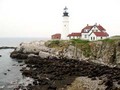
Untitledby emerygirl25Comment by Anders: Did you have some problems with the resizing? Looks like this photo looked great in the original, maybe the main lighthouse filling the frame would have been more effective for the challenge? I think Black & White conversion would have been really great! |
| 01/31/2008 09:48:11 AM |
Untitledby emerygirl25Comment by keone: quite blurry and pixilated. Would have been much better if this was sharp and zoomed in a little more on the house. |
| 01/30/2008 06:57:36 PM |
Untitledby emerygirl25Comment by SaraR: This is a pretty good composition of an interesting scene, but the horrible compression artifacts really detract! If you are a new member and need advice on uploading future entries, drop me a PM. |
| 01/30/2008 05:30:32 PM |
Untitledby emerygirl25Comment by Lydia: This is very well composed, but not sharply focused enough to be a winner, in my opinion. The blues could be upped a bit, also, to make it more appealing. |
| 01/30/2008 05:06:49 PM |
Untitledby emerygirl25Comment by Creature: This picture looks like it was enlarged from something half the size (heavily pixelated), out of focus, plus the Light is washed out against the blown sky. Portland Head Light is otherwise very photogenic... |
Home -
Challenges -
Community -
League -
Photos -
Cameras -
Lenses -
Learn -
Help -
Terms of Use -
Privacy -
Top ^
DPChallenge, and website content and design, Copyright © 2001-2026 Challenging Technologies, LLC.
All digital photo copyrights belong to the photographers and may not be used without permission.
Current Server Time: 07/16/2026 03:49:39 AM EDT.