Amber Waves of Grainby
banmornComment by Bear_Music: GREETINGS FROM THE CRITIQUE CLUB!
This is a difficult image for me to critique, because there's much about it that I love, but also areas in which it fails to impress me.
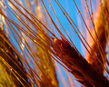
Color, for example; the rendering of the grasses and the grains themselves is nothing short of exquisite, and I say this as one who deals witht hese sorts of subjects all the time. BUT, the cartoonish quality of the sky-blue is actively detracting from the compostion as a whole, almost destroying my faith in it. I'd love to see a version where hue/sat was used to mute the sky a fair amount.
Sharpness, ficus, acuity, spectacular, bokeh is lovely. BUT those danged water drops aren't pronounced enough to "sing", so they come across more as distractions than as positive elements.
The composition, in general, is strong, witht he well-expressed diagonal further emphasised by the converging, minor diagonals of the lesser elements. BUT the large, vertical, OOF grain mass on the right seems somehow clumsy amidst this grace and delicacy. Were it further back (and thus more OOF) or lighter, it would be less of an issue. Also, the sky is workign against you compositionally because the color is so startling and domiant; far more emphasis is being palced on these relatively random negative spaces than I think they warrant.
So, in summary, I see an extremely well-executed technical image that's really very appealing to look at, but I see it being limited by its minor, internal flaws so it's somewhat less than it might have been. I see it finished around 6.1, and that's about what I'd have guessed it would do. Nice shot!