| Image |
Comment |
| 01/12/2006 11:09:02 AM |
|
 Photographer found comment helpful. Photographer found comment helpful. |
| 01/12/2006 01:36:47 AM |
|
| Photographer found comment helpful. |
| 01/12/2006 12:06:32 AM |
|
| 01/11/2006 09:21:04 PM |
|
| Photographer found comment helpful. |
| 01/11/2006 09:12:16 PM |
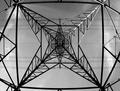
Overcast at the Harbourby ImagineerComment by ubique: I like the initial ambiguity. If it were on JPR's gallery wall at a ridiculous price, almost everyone's first-glance-from-a-distance conclusion would be to see the masts of yachts against the sky. Perhaps to wonder, an instant later, why one of them is lying over at an alarming (for yachts) angle. But you approach and the scene transforms into this clever romp with just a few everyday elements. And then there's the last laugh; the horizontal seams through what one thought of as the "sky". It has the qualities of a really good sketch - the appearance of being unfinished, but on closer inspection it is seen to be quite complete.
(edit typo) Message edited by author 2006-01-11 22:57:23. |
| Photographer found comment helpful. |
| 01/11/2006 07:32:48 PM |
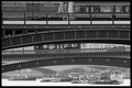
Crossingsby ImagineerComment by Imagineer: Thank you for all the comments here - in particular ubique for that eloquent critique. I had exercised restraint with the processing here, for the very reasons ubique mentions. It's easy to get heavy-handed with processing for the extra 'pop' that so often succeeds in a challenge environment. However, some subjects don't need pushing which would only lose some of the detail in the outer extremes of the scale (there's a full tonal range in this shot).
I really did want to find a subject that I could shoot despite some totally uninteresting light on a miserably cold, overcast day. Thankfully, it seems to have pleased some.
: ) Message edited by author 2006-01-11 19:33:19. |
| 01/11/2006 06:44:45 PM |
Crossingsby ImagineerComment by ubique: I've had second thoughts about this image. Not on its quality; I still like it very much (see original comment below). It's about the processing. Several commentators suggested stronger contrast, yet two specifically applauded the contrast as submitted. And most (including me) commented on the appeal of the stacked vertical layers. But there's another dimension of layers here - look at the horizontal layers. There is a beautiful relationship between tone and horizontal distance in this image. In some places it's bold (the background buildings visible through the mid-layers of the bridge, versus the bridge), and in some places subtle (the watercraft through to and beyond the second bridge). There's even a gentle tonal separation-by-distance of the major parts of the foreground bridge structure. So, the moderately long focal length compresses the scene, but the tonal control deftly separates the elements within it. Elegant. I think this would have been lost with stronger contrast. Now I like it even more. |
| Photographer found comment helpful. |
| 01/11/2006 06:19:56 PM |
|
| Photographer found comment helpful. |
| 01/11/2006 01:53:39 PM |
|
| Photographer found comment helpful. |
| 01/11/2006 12:35:44 PM |
|
| Photographer found comment helpful. |
Home -
Challenges -
Community -
League -
Photos -
Cameras -
Lenses -
Learn -
Help -
Terms of Use -
Privacy -
Top ^
DPChallenge, and website content and design, Copyright © 2001-2026 Challenging Technologies, LLC.
All digital photo copyrights belong to the photographers and may not be used without permission.
Current Server Time: 06/24/2026 06:41:47 PM EDT.