DPChallenge: A Digital Photography Contest You are not logged in. (log in or register
 
Browse Settings
Currently viewing:
Registered Userdanwan

Show comments:

Per page:

Order:

Comments:


Comments Received by danwan
Pages:  
Showing 41 - 50 of ~59
Image Comment
Back to Back - Old to New
07/22/2003 10:58:12 PM
Back to Back - Old to New
by danwan

Comment by DennisF:
Good contrasting subjects. The image is hard to see because everything runs together - ironically, I think it could use more ocntrast.
Photographer found comment helpful.
Back to Back - Old to New
07/22/2003 01:45:58 PM
Back to Back - Old to New
by danwan

Comment by dacrazyrn:
Like the concept and composition. would like the brightness down a bit. left area on the street is blown out
Photographer found comment helpful.
Back to Back - Old to New
07/22/2003 01:27:28 PM
Back to Back - Old to New
by danwan

Comment by MarkS224:
Very pixalated. Learn more about resizing. I like the old man and donkey cart, hope you took some of them without the truck for your portfolio
Photographer found comment helpful.
Back to Back - Old to New
07/21/2003 09:23:55 AM
Back to Back - Old to New
by danwan

Comment by e301:
Nice idea; the framing seems a little obvious, and doesn't do much for the structural contrast of the two elements. Perhaps a touch or two over-exposed, and over-sharpened (lots of the lines have become jagged).
Photographer found comment helpful.
Back to Back - Old to New
07/21/2003 05:03:25 AM
Back to Back - Old to New
by danwan

Comment by hortopth:
great take on it- and nice catch
Photographer found comment helpful.
Back to Back - Old to New
07/21/2003 03:46:34 AM
Back to Back - Old to New
by danwan

Comment by Alpine99:
Nice contracting image.. Overall the light looks too bright and the image seems to have been over-sharpened?
Photographer found comment helpful.
Back to Back - Old to New
07/21/2003 12:32:12 AM
Back to Back - Old to New
by danwan

Comment by Refracted:
The composition is nice, and the idea is great, but the overshaprened nature of the shot is detracting alot from it personally. It looks like it could have been made a bit bigger also. 6
Photographer found comment helpful.
Less is More
05/29/2003 01:28:51 PM
Less is More
by danwan

Comment by ursula:
FROM THE CRITIQUE CLUB

Hi, Wanda,

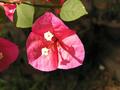
Your first entry! And you went with a flower macro, that's GUTSY! Your kids/husband must love you a lot. In Argentina, where I grew up, we called this flower "Santa Rita". It's one of my favourites, but in Canada it doesn't grow outdoors.

Your entry meets the challenge, although arguably the "red" is actually a "dark pink". On first impression, the photo looks very clear, but it doesn't show enough detail because of the angle at which you placed the flower, and the hard light.

Focus: Very good, in particular around the edges of the flower petals.

Lighting: A bit of a problem in this photo. Even though the light comes from the top left and not from right above, it is a bit harsh (as your commenters below pointed out already). A couple suggestions are to take the picture from a different angle, or maybe later in the day, or to block the direct light (e.g. with a piece of white paper).

Composition: A direct from the top approach can be quite dramatic, but IMO in this case it doesn't do justice to the beauty of this flower. I think your idea to include the leaves is very good. Maybe you could try taking a view from the side of this flower, with leaves right behind it, kind of cradling it, maybe even a cluster of flowers.

The fainter flowers behind the petals are OK, but the one petal to the left is distracting. Same goes for the spots to the right hand side of the picture. Maybe closing in to the flower a bit more to better fill the space would give you a good shot. Something to try :)

Overall: Pretty good, especially for a first attempt at close-ups. Keep going! I'm looking forward to seeing more of your pictures.

Ursula (uabresch)
Questions, comments, complaints ... feel free to contact me.

Less is More
05/25/2003 11:43:53 PM
Less is More
by danwan

Comment by dsidwell:
Very interesting flower. I like how the two leaves add informality to this image. Lighting seems a bit harsh.
Less is More
05/23/2003 11:29:37 PM
Less is More
by danwan

Comment by Niten:
the Lighting is to harsh. use a diffuser in to block the direct sunlight if you can.
Photographer found comment helpful.
Pages:  
Showing 41 - 50 of ~59


Home - Challenges - Community - League - Photos - Cameras - Lenses - Learn - Help - Terms of Use - Privacy - Top ^
DPChallenge, and website content and design, Copyright © 2001-2025 Challenging Technologies, LLC.
All digital photo copyrights belong to the photographers and may not be used without permission.
Current Server Time: 08/16/2025 11:28:55 AM EDT.