DPChallenge: A Digital Photography Contest You are not logged in. (log in or register
 
Browse Settings
Currently viewing:
Registered Userhughletheren

Show comments:

Per page:

Order:

Comments:


Comments Received by hughletheren
Pages:   ... [98] [99] [100] [101] [102] [103] [104] [105] [106]
Showing 1031 - 1040 of ~1058
Image Comment
St Spyridon glows
05/28/2003 06:16:24 AM
St Spyridon glows
by hughletheren

Comment by Musicman:
I wish you had cropped out the light at the bottom. maybe starting from the window or door above the light. just leaving a tint of the light shadow.
Thats would be my picture.
Photographer found comment helpful.
St Spyridon glows
05/26/2003 03:50:16 PM
St Spyridon glows
by hughletheren

Comment by dacrazyrn:
Great subject. Of course, the blown out area draws my eye away from looking at the tower, and then have to work may way up. My monitor registers this with a slight rose colored hue to it. I would like a more sepia brownish tone (but I like those older photos that look that way)
Photographer found comment helpful.
St Spyridon glows
05/26/2003 01:58:47 AM
St Spyridon glows
by hughletheren

Comment by ChrisW123:
Seems like there's way to much red in it. Plus the tower looks a little tilted to the left. The contrast of this is good, but the toning ruined it I think. :(
Photographer found comment helpful.
Power Flower
05/23/2003 02:43:02 PM
Power Flower
by hughletheren

Comment by HBunch:
*Critique Club*
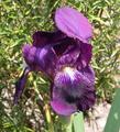
I do think that the background is the biggest issue here for me. It really clashes with the flower. See how the flower is graceful and smoothe? The background is sharp and choppy. It also doesn't work well with the pattern in the petals of the Iris.
The color of the flower is good, I like the color a lot. However, again, I think that it is hindered by the kind of dead looking, harshly lit background.
The angle and framing/cropping of the flower is ok, but I think I would have tried my best to get that leaf in the bottom right corner out of the shot. Because of DOF (which is otherwise good) that leaf is blurry, and a stands out a lot creating a bit of a distraction.
The DOF is ok. Blurring of the background is a good thing, especially in situations where the background really doesn't work out well. However, I wonder if it maybe could have been blurred even more? That could have helped.
Focus and clarity of the Iris is really good. I like the detail we can see in the veins of the petals, and the fuzzy center poking out at us is a nice touch as well.
I love these flowers. We have a bunch here at my house too, but they aren't close to blooming yet.
~Heather~
Photographer found comment helpful.
Beach Huts
05/22/2003 12:58:32 PM
Beach Huts
by hughletheren

Comment by inspzil:
Greetings from the Critique Club
By Inspzil

Composition - Good find for this challenge. I think the lines and regularity of the pattern work well for this not to mention the way the shadows go too. One thing with having this many lines, you wan't to keep this photo as vertical as possible. The top is definitely leaning to the left a bit. It's easy enough to check when you have a reference line very close to the edge of the frame. Generally speaking I think the composition is pretty good.

Technical - The photo is not as focused as it could be. I would've set the aperture as high as it would go. Judging by the shutter speed, you should be able to easily and still have enough light to effectively shoot this. As it is, I personally would've sped up the shutter a bit. Less exposure gives more saturation. This isn't necessarily over-exposed, but it would be a little more saturated with a quicker shutter. I'm not sure if you can sharpen this one a little more with no ill-effects or not, but you may want to try that if you haven't already. A little more saturation via Photoshop is always an option too.

Overall - I think its not a real compelling subject, but it is very fitting for this challenge. I think with a few minor changes to the colors via PS or a quicker shutter would be advantageous. Something else in the picture to give it a focal point might have been a good idea. Maybe even a person. Good luck to you in future challenges - Inspzil
Photographer found comment helpful.
Power Flower
05/20/2003 11:48:04 PM
Power Flower
by hughletheren

Comment by Bitz:
Beautiful image! The only detraction for me is the glare of the sun which tends to wash out your background. Excellent focus on the subject!
Photographer found comment helpful.
Power Flower
05/20/2003 02:25:17 PM
Power Flower
by hughletheren

Comment by Chuckie:
nice job i really like the colors
Photographer found comment helpful.
Power Flower
05/19/2003 09:04:51 PM
Power Flower
by hughletheren

Comment by frisca:
I feel the background is really too busy and the lighting is a bit too harsh with the highlights and shadows its creating to really capture the detail of this flower. maybe a simpler background (a different angle on the flower?) or a shallower DOF to blur more of the background and keep attention on the flower.
Photographer found comment helpful.
Power Flower
05/18/2003 08:59:15 PM
Power Flower
by hughletheren

Comment by Dim7:
nice 6
Power Flower
05/18/2003 03:26:08 PM
Power Flower
by hughletheren

Comment by pinback:
Would be nice but the bloom is rather past its best, I'm afraid.
Pages:   ... [98] [99] [100] [101] [102] [103] [104] [105] [106]
Showing 1031 - 1040 of ~1058


Home - Challenges - Community - League - Photos - Cameras - Lenses - Learn - Help - Terms of Use - Privacy - Top ^
DPChallenge, and website content and design, Copyright © 2001-2025 Challenging Technologies, LLC.
All digital photo copyrights belong to the photographers and may not be used without permission.
Current Server Time: 06/16/2025 05:55:49 AM EDT.