| Author | Thread |
|
|
09/21/2004 03:25:44 PM |
|
I must admit to knowing nothing much of photography and only joining to view other's work. This strikes me as a beautiful photograph. |
|
Comments Made During the Challenge  |
|
|
05/31/2003 12:02:03 PM |
|
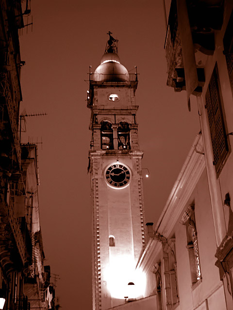
the light bulb is a litle too bright but love the setting...neat angle. |
|
 Photographer found comment helpful. Photographer found comment helpful. |
|
|
05/29/2003 10:41:06 PM |
|
This is an interesting composition. Unfortunately, I feel the harsh light on the bottom center is far too distracting. A tighter crop may help this. I really like from the clock upwards and like the tone as well:). |
|
| Photographer found comment helpful. |
|
|
05/28/2003 05:42:52 PM |
|
Is it just me or is there a slight tilt to the left? I like the idea, but the execution doesn't "wow" me. 6 Jak |
|
| Photographer found comment helpful. |
|
|
05/28/2003 11:28:32 AM |
|
nice shot, not sure if i like the use of the red/brown, seems a little garish on the left side, but overall, good shot :) |
|
| Photographer found comment helpful. |
|
|
05/28/2003 06:16:24 AM |
I wish you had cropped out the light at the bottom. maybe starting from the window or door above the light. just leaving a tint of the light shadow.
Thats would be my picture. |
|
| Photographer found comment helpful. |
|
|
05/26/2003 03:50:16 PM |
|
Great subject. Of course, the blown out area draws my eye away from looking at the tower, and then have to work may way up. My monitor registers this with a slight rose colored hue to it. I would like a more sepia brownish tone (but I like those older photos that look that way) |
|
| Photographer found comment helpful. |
|
|
05/26/2003 01:58:47 AM |
|
Seems like there's way to much red in it. Plus the tower looks a little tilted to the left. The contrast of this is good, but the toning ruined it I think. :( |
|
| Photographer found comment helpful. |
Home -
Challenges -
Community -
League -
Photos -
Cameras -
Lenses -
Learn -
Help -
Terms of Use -
Privacy -
Top ^
DPChallenge, and website content and design, Copyright © 2001-2026 Challenging Technologies, LLC.
All digital photo copyrights belong to the photographers and may not be used without permission.
Current Server Time: 06/28/2026 03:55:39 PM EDT.