| Image |
Comment |
| 05/05/2005 07:20:34 PM |
|
 Photographer found comment helpful. Photographer found comment helpful. |
| 05/05/2005 04:19:47 PM |
|
| Photographer found comment helpful. |
| 05/05/2005 12:58:59 PM |
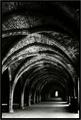
Hauntedby BobsterLobsterComment by Kavey: Great composition - including so much ceiling really emphasises the height of it as well as the sense of the viewer being insignificant. Lovely detail of bricks, high contrast black and white working well for this. Doesn't convey haunted to me but does make me think of loneliness, emptiness, possibly silence, serenity... |
| Photographer found comment helpful. |
| 05/05/2005 11:25:14 AM |
Foreverby BobsterLobsterComment by HBunch: *Critique Club*
The first thing I notice about this photo is the background. It's very bright compared to the rest of the photo. The bright shapes really stand out in the shot a lot. The background actually kind of begins to bleed into the ring a bit. See on the bottom ring on the far side of the ring, how it blends into the background? It also does this a bit on the top ring as well.
DOF seems to be very narrow. Maybe a little too narrow. The rings don't appear to be in focus. I think the combination of harsh lighting on the rings and the shallow DOF makes the rings look out of focus. Having a very small part of the rock be in such good focus, and the fact that that stands out so well, increases the appearance that the rings are out of focus.
I really like the shot. It's nicely set up and simple, yet effective. The general scene is visually appealing. The way you have the rings in the bottom right works.
Overall a nice shot that, in my opinion, would benefit from different lighting conditions and a little more DOF.
~Heather~ |
| Photographer found comment helpful. |
| 05/05/2005 03:17:03 AM |
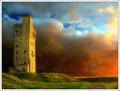
Sunset at Castle Hill by BobsterLobsterComment by BobsterLobster: Originally posted by Parker:
Love the colors, but the burning is very unnatural. |
As I'm sure I've mentioned, there was do dodging or burning in this photo, just curves adjustments. |
| 05/04/2005 07:32:39 PM |
|
| Photographer found comment helpful. |
| 05/04/2005 06:15:37 PM |
|
| Photographer found comment helpful. |
| 05/04/2005 07:14:50 AM |
Jaalaby BobsterLobsterComment by BobsterLobster: Originally posted by SnapperL:
the highlights are far to overexposed. You should use the highlight/shadow tool in PS. |
Completely disagree. It's supposed to look like that. What would the highlight/shadow tool do anyway? The highlights are all deliberately burnt out. There's no info there to recover. That tool is way overused anyway.
Edit... oh, I get it... I must have just left a similar comment on one of your photos.
Another edit... OMG, I was right, how remarkably petty. Message edited by author 2005-05-09 04:22:30. |
| 05/04/2005 06:31:46 AM |
Hauntedby BobsterLobsterComment by samtrundle: This is a flat out brilliant photograph. Might not 'capture an emotion' but it couldn't be much moodier if it tried. Excellent processing and use of black and white. |
| Photographer found comment helpful. |
| 05/03/2005 11:12:31 PM |
|
| Photographer found comment helpful. |
Home -
Challenges -
Community -
League -
Photos -
Cameras -
Lenses -
Learn -
Help -
Terms of Use -
Privacy -
Top ^
DPChallenge, and website content and design, Copyright © 2001-2026 Challenging Technologies, LLC.
All digital photo copyrights belong to the photographers and may not be used without permission.
Current Server Time: 07/27/2026 08:19:38 AM EDT.