| Image |
Comment |
| 03/25/2004 05:48:24 PM |
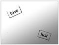
Poetry Magazineby BobsterLobsterComment by pcody: I don't know, but this seems to be typed words on some paper. If they are those little magnets, there isn't a way for me to tell because the lighting is so flat. The spots all over could have been cloned out for the challenge, unless you are making some statement about how love is dirty business. Sorry to sound so negative. A major headache with digital photos is all the dust on the sensor. OK, maybe you are saying love is pure and lust is dirty, but there has to be a better way to get the point across.
Sorta like one of those ink blot tests? I'm beginning to like this one. Will come back to see the comments. |
 Photographer found comment helpful. Photographer found comment helpful. |
| 03/25/2004 01:31:11 PM |
|
| 03/23/2004 09:16:34 AM |
|
| Photographer found comment helpful. |
| 03/23/2004 05:10:39 AM |
Poetry Magazineby BobsterLobsterComment by cbonsall: (I'm writing this to everyone who submitted a landscape shot) The challenge was to produce a shot worthy of a magazine cover but to me a shot like this is not suitable to be put on a "portrait" format magazine.
Is that fridge magnet poetry? Nice idea, not sure about the contrast editing though
---ADDITIONAL---
Due to forum discussions and accusations that marking landscapes down is nitpicking, I'm going through them and remarking. I still think some of the landscapes would not make good covers because of their orientation but I am no longer marking down because of that.
I still think landscape is inapropriate for the majority of magazines but I'll give the benefit of the doubt to the photographers. |
| 03/23/2004 12:42:52 AM |
|
| 03/22/2004 03:11:09 PM |
Poetry Magazineby BobsterLobsterComment by Tallbloke: I had a quick look on the internet but couldn't find "poetry magazine". Interesting shot anyhow but I'm marking all "landscape" shots a point lower as I don't believe they fit the challenge parameters. |
| 03/22/2004 10:08:48 AM |
Poetry Magazineby BobsterLobsterComment by jpochard: I don't think I would find this cover appealing, looking over a magazine rack. It's not eyecatching, and it's not intriguing. Points for trying something different, but the black "flecks" and the overall shot just really don't appeal to me. |
| Photographer found comment helpful. |
| 03/22/2004 01:18:31 AM |
Poetry Magazineby BobsterLobsterComment by TooCool: Your black speckles through this shot are very distracting and very easy to deal with in the advanced editing rules. I'm confused as to why you would leave them in. Overall the shot doesn't have much interest or staying power.
TC |
| Photographer found comment helpful. |
| 01/30/2004 01:11:11 PM |
|
| Photographer found comment helpful. |
| 12/14/2003 11:05:09 PM |
Curvesby BobsterLobsterComment by jaimeegrl: I too nearly did a guitar shot. This is much better than mine would have been. Lighting is excellent. Soft focus works well. Well Done |
| Photographer found comment helpful. |
Home -
Challenges -
Community -
League -
Photos -
Cameras -
Lenses -
Learn -
Help -
Terms of Use -
Privacy -
Top ^
DPChallenge, and website content and design, Copyright © 2001-2026 Challenging Technologies, LLC.
All digital photo copyrights belong to the photographers and may not be used without permission.
Current Server Time: 07/27/2026 05:51:05 AM EDT.