The Dividerby
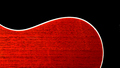
arron_christensenComment by ambaker: Critique Club Review:
Color Saturation and Hue: Very nicely done. Colors are obviously manipulated, but fit well in this image.
Brightness and contrast: Also very nicely done. The absolute black for congtrast works quite well. Highlighted areas carry detail very well.
Focus and depth of field. Focus is very sharp, which is needed in this image. Depth of field: N/A Surface is two dimensional.
As pointed out below, there is some sort of artifact along the right edge of the frame a bit above the centerline. However, I wouln't think it sufficient to seriously damage the vote on this image.
I like the color, love the featurless black. I would have probably given this image an 8. (I didn't vote.) I'm not sure what it is about this image that didn't get you higher. The purists, would have seen one line. So that wasn't it. It's almost as if the picture doesn't look quite finished. If the red area were smaller, that wouldn't have helped, and I'm not sure more red would have done it either. I've looked at different angles, the red starting in a corner, and nothing makes a huge difference. So there was no obvious "mistake". At this point I think maybe a light, modern, non-competing border (whatever that might be) would finish the image and set it off.
Nicely done...