| Image |
Comment |
| 10/06/2009 09:57:08 AM |
|
| 10/02/2009 05:08:48 PM |
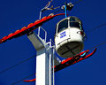
Cable carby gminkComment by acg83: I would not use the words twisted or curved to describe this.
I do like the colours. |
| 10/01/2009 02:48:50 PM |
Cable carby gminkComment by Melethia: I can see the wheel bits and the car as being curved, but "twisted" or "curved" wouldn't be the first thing to come to mind outside of the challenge title. It is, however, well composed and very bold and vibrant. |
| 10/01/2009 09:21:35 AM |
Cable carby gminkComment by Jaded_Housewife: *not voting as I'm in this challenge-just commenting since I've seen requests for comments in the challenge thread*
Fantastic color and clarity. I don't however see what's twisted or curved about this. there are a few different curves in it but none really seem to be the focus. The straight lines that flow through the frame so wonderfully actually seem more like the focus to me.
HTH |
| 09/30/2009 01:33:34 PM |
Cable carby gminkComment by Yo_Spiff: Colors really pop on this. Maybe a little too strong, and I am looking at this on my calibrated monitor which always shows my images with a bit less oomph. |
| 09/25/2009 04:53:44 AM |
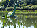
Primevil swampby gminkComment by FrankRobinson: Good DOF, shame about the lack of definition. Nice composition but could benefit from more contrast to make it 'pop' |
| 09/23/2009 12:17:08 AM |
|
| 09/22/2009 05:10:45 PM |
|
| 09/16/2009 10:47:00 PM |
FD 9by gminkComment by vikas: Meets the challenge : 2/3 - I don't know what "Burn ban in Effect" means.. so I might be missing out on something!
Execution : 1/2 - Shallower DOF would have worked better, yellow flowers are nice but the dried grass is distracting!
Originality : 1/2
and everything else : 0/3
total : 4/10 |
| 09/16/2009 04:02:26 PM |
FD 9by gminkComment by ttreit: I think if you had isolated the sign a bit more it would have helped. As it is the sign seems to flat against the background and also seems slightly out of focus.
I like the general idea and it definitely meets the challenge. |
Home -
Challenges -
Community -
League -
Photos -
Cameras -
Lenses -
Learn -
Help -
Terms of Use -
Privacy -
Top ^
DPChallenge, and website content and design, Copyright © 2001-2026 Challenging Technologies, LLC.
All digital photo copyrights belong to the photographers and may not be used without permission.
Current Server Time: 06/21/2026 08:43:28 AM EDT.