DPChallenge: A Digital Photography Contest You are not logged in. (log in or register
 
Browse Settings
Currently viewing:
Membercynthiann

Show comments:

Per page:

Order:

Comments:


Comments Received by cynthiann
Pages:   ... [193] [194] [195] [196] [197] [198] [199] ... [206]
Showing 1951 - 1960 of ~2054
Image Comment
rearmirror.jpg
04/09/2008 03:26:29 PM
rearmirror.jpg
by cynthiann

Comment by Haneck:
very nice, I love the creativity. :)
Photographer found comment helpful.
originalbluejay.jpg
04/09/2008 03:24:35 PM
originalbluejay.jpg
by cynthiann

Comment by Haneck:
I think I pretty much agree with what everyone is saying... there's too much contrast and saturation in your final images. This image certainly does have LOTS of potential though - it's beautiful! First of all, if there had been any way to raise the camera angle slightly so that that blurry thing at the bottom of the photo was gone, that might give you more to work with. but maybe doing that would have scared the bird away or something. What I personally would do with this image is crop it a good deal less - just enough to get the distracting things on the edges out of the way. Leave the branch in there - it adds some interest to the shot. Then I would add a little bit of contrast. The colors are already pretty good, I probably would't mess with that. One thing I use a ton and would suggest playing around with is the burn and dodge tools - if you have that on your processing program. good luck! :)
Photographer found comment helpful.
Ye Old Stompin' Ground
04/09/2008 10:41:22 AM
Ye Old Stompin' Ground
by cynthiann

Comment by eschelar:
critique as requested in the forums.

Issues:
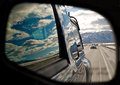
#1 subject of the photo = building. It can work for you. It can also fail to work for you. Personally, I think you did OK with what you had to work with, but there is no real sense of dramatics with this image. Nothing interesting about the POV. It's just a building from standing height eye level. There is nothing else in the picture to give context or compare to anything else in the pic. The human interest aspect is a bit lacking.

#2 Processing. A number of issues here, but not all bad. I like the processing on the building as related to the general look of it. Some problems that are commonly penalized here on DPC such as an 'overprocessed' look (although that one's a bit pot luck on how it's received IMHO - some people manage OK with an overprocessed look for certain reasons), blown highlights and not-smooth color transitions. I am guessing from your comment 'a different approach for me' that much of this you are aware of and at least some of it was intentional.

Specifically:
- The whites in the clouds are blown. This could be avoided by bringing the midtones up using curves (or levels if you want the slightly more complicated route) instead of brightness and contrast. It appears that your pushed the brightness of the building since it seems quite bright.
- The blues in the sky are too strong and not natural looking. Again, this may be intentional, but it's just a bit over the top I think... The sky is not a major element of the picture, so there's no real reason that it should be emphasized so strongly. This could be a result of pushing the saturation too hard, or something else, but a possible solution (and legal in basic) is to use saturation on a specific channel and tone it back a bit. Selective color can also help here if needed.

#3 Lines. Honestly, I'm not feeling anything from any of the lines in the picture. None of them are specifically pushing my eyes in any particular direction. For a picture full of lines, none of them seem to have much purpose. It could be worse.

Bottom line, I think the subject of the picture just isn't that DPC friendly. If it were for a newspaper article about a record store called the family dog or something, it would be fine. It's a decent presentation of the side of a building.

I think it would have been helped a lot by a skinny kid in running shoes with no socks bouncing a basketball though. or something...
Photographer found comment helpful.
In the Dark with this Challenge
04/09/2008 10:28:53 AM
In the Dark with this Challenge
by cynthiann

Comment by Yo_Spiff:
Feedback, per your request in the forums:

I think the biggest issue with this is the extreme crop. It's a good shot of the bird, but I think enlarging this small section of the image resulted in a loss lack of detail at this size. It seems a little soft, and sharpening on the computer probably would not give it what it needs. I do like the colors. A little more than this may have been too much, however. How are you doing your adjustments? Are you using curves, or just brightness/contrast/saturation? Try curves if you have not used it before. (Not available in Photoshop elements, but you can obtain a free plug in that will add the ability.)

As far as the challenge goes, I think it may have been DNMC for the DNMC challenge. (I know that sounds odd) I think the ones that did better for this April fool's challenge were the ones that were a little more bizarre or humorous in nature. Some people took it as a freestudy, but I think it was actually the chance to to those weird images that don't normally fit anywhere else.

Photographer found comment helpful.
In the Dark with this Challenge
04/06/2008 10:18:51 PM
In the Dark with this Challenge
by cynthiann

Comment by Jaybug:
love the colors... and how crisp it looks. Great job. Gave you a ten! Good Luck
Photographer found comment helpful.
In the Dark with this Challenge
04/05/2008 10:23:24 PM
In the Dark with this Challenge
by cynthiann

Comment by one2one:
The colours seem saturated a little too much to me. Lovely image.
Photographer found comment helpful.
In the Dark with this Challenge
04/03/2008 11:14:29 AM
Photographer found comment helpful.
In the Dark with this Challenge
04/02/2008 02:57:46 AM
In the Dark with this Challenge
by cynthiann

Comment by bobonacus:
I'm sorry but this really doesn't meet the challenge at all, 10
Photographer found comment helpful.
Cold Dark Winter Famish
03/24/2008 01:25:01 AM
Cold Dark Winter Famish
by cynthiann

Comment by MelonMusketeer:
I think that what happened with the voting was not about the way the bird looks, which is very good, but about the dark background. It looks like a night shot, and cardinals rarely move about at night. Nice close up shot of the cardinal though.
Photographer found comment helpful.
Cold Dark Winter Famish
03/23/2008 09:08:54 PM
Cold Dark Winter Famish
by cynthiann

Comment by trevytrev:
Nice shot with good detail. I do feel the flash lighting is a bit harsh and that this is a bit of a shoehorn for the challenge.
Photographer found comment helpful.
Pages:   ... [193] [194] [195] [196] [197] [198] [199] ... [206]
Showing 1951 - 1960 of ~2054


Home - Challenges - Community - League - Photos - Cameras - Lenses - Learn - Help - Terms of Use - Privacy - Top ^
DPChallenge, and website content and design, Copyright © 2001-2025 Challenging Technologies, LLC.
All digital photo copyrights belong to the photographers and may not be used without permission.
Current Server Time: 06/16/2025 11:28:29 AM EDT.