| Image |
Comment |
| 01/07/2011 01:12:37 PM |
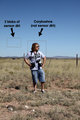
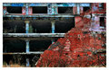
Sensor dirt1by Yo_SpiffComment by Cory: Originally posted by Yo_Spiff:
Originally posted by Art Roflmao:
They always said "Cory was outstanding in his field" |
Actually, it's not his field. In fact, he was trespassing in someone else's. |
LOL x2 |
 Photographer found comment helpful. Photographer found comment helpful. |
| 01/06/2011 12:53:57 PM |
|
| Photographer found comment helpful. |
| 01/06/2011 12:01:33 PM |
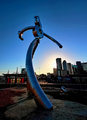
Riveting by Yo_SpiffComment by bohemka: Outstanding image. So sharp and smooth and interestingly composed. Great display of the challenge theme. An eye-catcher from thumb to full-size. Nice one. |
| Photographer found comment helpful. |
| 01/06/2011 06:45:42 AM |
|
| Photographer found comment helpful. |
| 01/06/2011 05:15:17 AM |
|
| Photographer found comment helpful. |
| 01/06/2011 01:18:02 AM |
|
| Photographer found comment helpful. |
| 01/05/2011 07:29:19 PM |
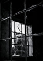
What once wasby Yo_SpiffComment by Abra: Hehe, you really like that spot don't you Spiffy. This time framing the window framing the building works nicely. Judging by the shadow on the window sill I'm guessing this was taken at the same time as the other with the lovely colours. Was your choice to go b&w a decision to differentiate from your other shot? I’m not sure if it really works here but that may be because I know the other shot. Looking closer I feel you’ve done a good job of the conversions. I especially like the effect on the broken glass. Good luck. |
| Photographer found comment helpful. |
| 01/05/2011 09:52:02 AM |
|
| Photographer found comment helpful. |
| 01/05/2011 05:22:13 AM |
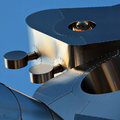
Rivetingby Yo_SpiffComment by tome: Wow - can't wait to see what this is. The reflected colors are great with the blue background. I'm thinking that maybe a smaller squared crop would be as effective, the bottom piece is a bit distracting to me. Still a top pick. |
| Photographer found comment helpful. |
| 01/05/2011 04:10:20 AM |
Exposedby Yo_SpiffComment by inshaala: I'd agree with the border comment (you already have a light coloured surround to the shot in the site's colour scheme), it may look a bit better if you put a black "stroke" on the edge so the image doesnt bleed into the border (see light patch on the edge at lower 3rd on left hand side, and general light patches of grass at the bottom) - or you could just use the site's 1px "stroke" and pack more of a punch with more photo...
|
| Photographer found comment helpful. |
Home -
Challenges -
Community -
League -
Photos -
Cameras -
Lenses -
Learn -
Help -
Terms of Use -
Privacy -
Top ^
DPChallenge, and website content and design, Copyright © 2001-2026 Challenging Technologies, LLC.
All digital photo copyrights belong to the photographers and may not be used without permission.
Current Server Time: 05/18/2026 01:26:36 PM EDT.