| Image |
Comment |
| 04/10/2002 12:45:00 PM |
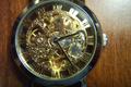
Skeletonby fsearlesComment by Mousie: Soft focus and blown out hilights take a a lot away from this. Did you sharpen it? It's also cropped more on the top than on the bottom. |
| 04/09/2002 04:22:00 PM |
|
| 04/09/2002 01:09:00 PM |
|
| 04/09/2002 12:42:00 PM |
Skeletonby fsearlesComment by Maverick: Would have looked nicer centerred I think. Lighting is a bit harsh, but is necessary to make the watch shine. Overally a good photo. |
| 04/09/2002 11:31:00 AM |
|
| 04/09/2002 07:28:00 AM |
Skeletonby fsearlesComment by yyyap: nice idea. i would've preferred a uniformly dark background, though. the patch of white in the upper right doesn't work for me. |
| 04/09/2002 07:24:00 AM |
|
| 04/08/2002 04:30:00 PM |
|
| 04/08/2002 04:27:00 PM |
Skeletonby fsearlesComment by Sonifo: To much light. Maybe if you shut the flash off and had the watch in a well lit room, the light would have been more evenly distributed on the watch. I like your idea. :) |
| 04/08/2002 04:12:00 PM |
|
Home -
Challenges -
Community -
League -
Photos -
Cameras -
Lenses -
Learn -
Help -
Terms of Use -
Privacy -
Top ^
DPChallenge, and website content and design, Copyright © 2001-2026 Challenging Technologies, LLC.
All digital photo copyrights belong to the photographers and may not be used without permission.
Current Server Time: 07/15/2026 02:37:37 PM EDT.