| Image |
Comment |
| 05/26/2003 01:54:45 AM |
|
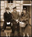
| 05/26/2003 01:05:37 AM |
Welcome Homeby tragicharpyComment by RiderGal: Very interesting.... looks like an oldtime photo, which is what I'm guessing you were going for. There are some things that really bother me here though... There is quite a bit of extra space at the top, and the feet are cut off, but only slightly... filling the frame is always good, I would have positioned the camera differently, so that you got the entire subjects in the photo, and didn't leave as much room at the top. Watch Your Background! The window frame looks like it' half coming out of the girls head on the left, and completely growing out of the man's head. Also the business of thee background detracts from the subjeect, using a lower DOF, to clean up the background, would have helped this a lot. |
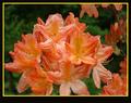
| 05/20/2003 11:05:11 PM |
Summerby tragicharpyComment by Bitz: Wonderful colors and good composition. The soft focus is the only detraction for me. |
| 05/20/2003 01:37:48 PM |
|
| 05/19/2003 02:43:16 PM |
Summerby tragicharpyComment by karmat: The color seems a little muted to me. Would it have been possible to saturate it just a touch? The depth of field is very nice. |
| 05/18/2003 11:41:03 PM |
|
| 05/17/2003 12:50:50 PM |
Summerby tragicharpyComment by pinback: Pretty. Flowers look a little past their best and my eye is a little confused as to the main subject. Nice lighting though. |
| 05/16/2003 01:49:32 AM |
|
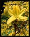
| 05/15/2003 08:07:10 PM |
Summerby tragicharpyComment by jaam: Nice macro, which I think you could have improved by cropping into the main bunch, leaving out the ones to the right, which are slightly distracting. Unfortunately I think that your boarder is also a bit distracting due to the yellow (would think that you would have been better off using a tri-border - black the pink/orange of the flowers, then black) border and due to the rather thick lower boarder. |
 Photographer found comment helpful. Photographer found comment helpful. |
| 05/15/2003 11:48:35 AM |
Yellowby tragicharpyComment by wewillexplore: A good shot with a strange DoF (the green stamen is blurry, but the LLC is all in focus?) Good use of yellows, but no reds and blues. |
Home -
Challenges -
Community -
League -
Photos -
Cameras -
Lenses -
Learn -
Help -
Terms of Use -
Privacy -
Top ^
DPChallenge, and website content and design, Copyright © 2001-2026 Challenging Technologies, LLC.
All digital photo copyrights belong to the photographers and may not be used without permission.
Current Server Time: 07/15/2026 05:34:22 PM EDT.