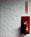
Fire extinguisherby
MrAkamaiComment by Jesuispeure: Greetings from the Critique Club!
First of all, I really enjoyed this pic during the challenge. It's a shot you should be proud of.
Composition: I think this is one of the strongest points of the picture. The far-right centering gives a lot of interest to an otherwise mundane subject. There is some issue with the border. I like the translucency, but the low opacity on top of the white does make the red lighter, hence pink. Maybe if you set the brush to "darken" or "soft light" instead of "normal" you could keep the texture with a more vibrant red color. I do like the inclusion of the border. The wall could go on and on for feet, but the border helps define the realm of the picture.
Technical: Personally, I like the shadowing on both the extinguisher and the wall. I don't think it's too dark; as you said, it helps show off the texture of the brick. It also gives it photo some mood- it's not a catalougue shot of a fire extinguisher. The bricks are quite distorted, especially on the bottom edge. However, the extinguisher seems to line up for the most part with the right hand border, which fools the eye a little.
Appeal: With 25 comments, you can see that people had a very strong reaction to this photo, whether good or bad, and that in and of it self speaks of the sucess of the photo. It's not middle of the road.
Great job!
Amanda