DPChallenge: A Digital Photography Contest You are not logged in. (log in or register
 
Browse Settings
Currently viewing:
Registered Usertolyanchik

Show comments:

Per page:

Order:

Comments:


Comments Received by tolyanchik
Pages:   ... ...
Showing 151 - 160 of ~206
Image Comment
Brittish Countryside
06/25/2003 12:35:26 AM
Brittish Countryside
by tolyanchik

Comment by alanfreed:
This feels like it's tilted to the right just a bit, but it's a great scene! Nice toning, also.
Photographer found comment helpful.
Brittish Countryside
06/25/2003 12:31:45 AM
Brittish Countryside
by tolyanchik

Comment by pncowley:
I do think your choice of black and white works well here, though the pic overall seems dark. The photo seems to be leaning a bit. I do love your composition with the branches in the foreground and your choice of subject is very cool.
Photographer found comment helpful.
My Home--New York... America...
06/11/2003 09:43:13 AM
My Home--New York... America...
by tolyanchik

Comment by tolyanchik:
To hbunch7187:

I also have a photo with "the smoke stack thingy" as a main element. Just go to //community.webshots.com/user/tolyanchik
I just did not want to present it here.
Milk... It Does A Body...
06/10/2003 08:46:08 PM
Milk... It Does A Body...
by tolyanchik

Comment by SweetKali:
there is a market lack of creativity here..perhaps pouring the milk all over the body of a person would have been more interesting.
Milk... It Does A Body...
06/10/2003 01:37:55 PM
Milk... It Does A Body...
by tolyanchik

Comment by qachyk:
Skim milk. Ick.

Considering how much of the required elements of your photo (milk, milk carton) are white, I think I would have chosen a different, even if not terribly darker, coloured stuffed animal. Also the lighting in this seems rather bright but it may be an artifact of teh chosen colours.

I like the basic idea, and the framing is not bad though maybe shifting the center just a bit downwards so the glass isn't almost sitting on the edge would have been nicer... some of that's a reaction to the homogenous colour scheme, though.
Photographer found comment helpful.
My Home--New York... America...
06/10/2003 11:28:23 AM
My Home--New York... America...
by tolyanchik

Comment by HBunch:
*Critique Club*
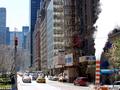
I see your statement against eloise, and at the risk of beint "not useful" I have to agree with her in a way. There is a lot in this shot, and it's very cluttered and busy. I do realize that this is representative of where you live, however, it doesn't make for a pleasing photo.
You mention the scaffolding, however, there is a large tree in front of the scaffolding. This tree creates a different pattern over the scaffold making it all blend into one big mush.
You mention the flag, but it is only peeking out from behind a branch, and is not a subject in the photo that stands out to me as important at all becuse of it being hidden. It is not 'standing proud'. It's concealed.
You mention the traffic, but it's so far away and tiny, that we don't get much detail out of that either.
The sky is bright and appears a little bright as it's putting a foggy blue cast over the building. This could be smog, or smoke also, but whatever causes it, the sky looks a bit blown out.
Now, you also mention that smoke stack thingy. I think that this is the most interesting part of the photo. Because it's right there, out in the open, and large enough to get detail out of, and also what I see to be the sharpest focus, THIS is what my eye is drawn to. My only disapointment with this is that you cut it in half. You didn't include the rest of it, and cut the sign in half leaving me wonder "what the heck is 'raise' suposed to mean.
I've never been here, but I'm quite sure this represents the busy, crowded life of New York very well. It's just not really pleasing to the eye.
I wonder how this would have been had you put more emphasis on one thing. You wouldn't have gotten ALL things in the shot, but you could have put enough of a creative spin on it to really make it punch. This is almost snapshotty.
This is my true honest opinion, and I hope you don't take offense.
~Heather~
Photographer found comment helpful.
Milk... It Does A Body...
06/09/2003 04:47:12 PM
Milk... It Does A Body...
by tolyanchik

Comment by jillz:
This looks overexposed.
Milk... It Does A Body...
06/07/2003 04:06:38 PM
Milk... It Does A Body...
by tolyanchik

Comment by Toddh:
possibly a little more emphasis on the milk might have worked better......
Photographer found comment helpful.
Milk... It Does A Body...
06/06/2003 05:37:14 PM
Milk... It Does A Body...
by tolyanchik

Comment by Olyuzi:
I think image is a bit overexposed to the point that the stuffed animal is lacking in detail.
Photographer found comment helpful.
Milk... It Does A Body...
06/05/2003 04:09:35 PM
Milk... It Does A Body...
by tolyanchik

Comment by vtruan:
To much white.
Pages:   ... ...
Showing 151 - 160 of ~206


Home - Challenges - Community - League - Photos - Cameras - Lenses - Learn - Help - Terms of Use - Privacy - Top ^
DPChallenge, and website content and design, Copyright © 2001-2025 Challenging Technologies, LLC.
All digital photo copyrights belong to the photographers and may not be used without permission.
Current Server Time: 08/20/2025 04:50:29 PM EDT.