|
|
| Image |
Comment |
| 06/19/2003 11:14:23 PM | no nameby sselmanComment by KarenB: I wish you had chosen a less cluttered background. as it is, it looks like the trees in the back are growing out of your head! LOL
Nice tones. |
| 06/18/2003 03:55:47 AM | no nameby sselmanComment by SharQ: Not a bad idea, but if you want to do this, I would recommend using a larger aperture the throw the background out of focus. (4) |
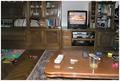
| 06/09/2003 01:02:08 PM | Creative messby sselmanComment by HBunch: *Critique Club*
This definately is representive of home, but I don't really see how it's creative. Looks like you were sitting on your couch, realized you needed a shot, reached over, grabbed the camera and shot. You say that it's creative, but I'm not seeing the creativity part.
The focus appears to be really soft throughout the photo as well. I can't even identify 3 of the items on the table, and the others are really soft focus. The items on the floor and on the shelves are also soft focus. Selective focus works sometimes, but I don't think it adds anything of interest at all here.
The angle and framing/cropping need some work too. The whole shelving unit/entertainment stand thing is leaning to the right. Looks like everything should slide off the shelves and out of the right of the photo.
The lighting in my opinion is also poor. There is what looks like a flash reflection in the Television set, and on this side of the table as well. I am wondering if the lighting is contributing to there being nothing in sharp focus. Sometimes when there isn't enough light, it hurts the focus.
It does fit the challenge, definatly your home, but I think it simply lacks 2 things, focus and a point of interest.
~Heather~ |
| 06/03/2003 05:35:17 PM | Creative messby sselmanComment by K-Rob: Maybe I'm wrong, but I get the feeling that this picture was not taken during the week of submital based on the war coverage that is on the TV. oH well, doesn't bother me any. |
| 06/03/2003 02:59:41 PM | Creative messby sselmanComment by skief: Ugly photo, but my idea of HOME :-) Kid's toys, remotes strewn, telephone, videocassettes, and the tv going, although looks like CNN?? Make it Foxnews, and I'm there :-) |
| 06/03/2003 01:43:17 PM | |
| 06/03/2003 11:15:50 AM | |
| 06/02/2003 07:58:03 PM | |
| 06/02/2003 06:04:22 PM | Creative messby sselmanComment by frisca: very literal interpretation of the challenge. I think you used your flash here, which has the effect of being too bright in the foreground, leaving the rest of the shot looking dark. Nothing else really wrong with it, except that its not the most rivetting composition. I think that will probably explain your placement more than anything. There just isn't any interest in the shot besides a documentation of your livingroom. :) (lovely and cosy though it seems!) |
| 06/01/2003 06:03:36 PM | Matrixby sselmanComment by HBunch: *Critique Club*
This is one of those reasons I wish people would leave a little information on the photo when asking for a CCC.
I have no clue what this is, what it means, or anything.
Hard to really leave a detailed comment without knowing SOMETHING.
I can say that it doesn't really appeal to me. I sat looking at this very perplexedly for awhile trying to figure out what the heck it is.
The lighting is dramatic, but maybe too dramatic. It engulfs your subject, whatever it is, and makes it really difficult to see and identify.
It also looks as if this is really really soft focus. Making it even harder to see what's going on in the shot.
The way this is really bright at the top and not quite as bright at the bottom leaves this a bit unballanced to me.
The color isn't bad, but I think it needs more than just ok color to be of interest to me.
Which there were more I could say.
~Heather~ |
Home -
Challenges -
Community -
League -
Photos -
Cameras -
Lenses -
Learn -
Help -
Terms of Use -
Privacy -
Top ^
DPChallenge, and website content and design, Copyright © 2001-2026 Challenging Technologies, LLC.
All digital photo copyrights belong to the photographers and may not be used without permission.
Current Server Time: 07/09/2026 01:32:03 AM EDT.
|