DPChallenge: A Digital Photography Contest You are not logged in. (log in or register
 
Browse Settings
Currently viewing:
Registered Userbruster54

Show comments:

Per page:

Order:

Comments:


Comments Received by bruster54
Pages:   ... ...
Showing 161 - 170 of ~437
Image Comment
Oriental Breeze
04/30/2003 10:34:33 PM
Oriental Breeze
by bruster54

Comment by bamaster:
Middle photo is a little lost to me. But I like the subjects.
Photographer found comment helpful.
Oriental Breeze
04/30/2003 09:41:33 AM
Oriental Breeze
by bruster54

Comment by jjbeguin:
This was a good choice for a subject. Somewhat there is to much empty space in the composition. Could have perhaps tried to have used frames of different sizes, close up views of the fans or have the fans overlap.
Photographer found comment helpful.
Oriental Breeze
04/29/2003 01:12:23 AM
Oriental Breeze
by bruster54

Comment by mcmurma:
I like the idea, but the fan in the middle is too dark and blends in too well with the background. Still, nicely done.
Photographer found comment helpful.
Oriental Breeze
04/28/2003 08:48:40 PM
Oriental Breeze
by bruster54

Comment by Jeileen:
The bottom fan - i want to open it as the other two are.... a bit too dark as well
Photographer found comment helpful.
Oriental Breeze
04/28/2003 03:47:17 PM
Oriental Breeze
by bruster54

Comment by ursula:
Beautiful idea! I like the colours, the layout, and the way the fans point from one side to the other. I think the composition would be more effective if the middle fan were stronger, consistent with the colour strength of the other two.
Photographer found comment helpful.
Oriental Breeze
04/28/2003 12:31:27 PM
Oriental Breeze
by bruster54

Comment by dsidwell:
I'd like to see this one in a larger format to see all of those intricate designs. wonderful lighting and tones here.
Oriental Breeze
04/28/2003 11:31:37 AM
Oriental Breeze
by bruster54

Comment by marbo:
Good idea and nicely layed out but i think the middle shot is a little weak.
Photographer found comment helpful.
Standing Alone
04/27/2003 11:37:41 AM
Standing Alone
by bruster54

Comment by lisae:
Cute. I like the composition of this. It's hard to see the plant against the busy background though.
Mother And Child
04/27/2003 01:17:49 AM
Mother And Child
by bruster54

Comment by thatguy:
i love the color of the young horse, good choice of subjects
A Beautiful Ending
04/26/2003 11:00:32 PM
A Beautiful Ending
by bruster54

Comment by jmsetzler:
Greetings from the Critique Club :)

Hi Bruster....

Challenge Theme:

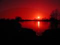
I think this photo may be slightly weak on the challenge theme overall... This sunset is a bit abstract with the red tinting, but I think it does meet the challenge.

Emotional/Artistic Impact:

This photo seems to be quite strong in this area. The red tint gives it an 'out of this world' feel. It could be a Martian landscape. This photo could be interpreted many ways. It has an apocalyptic feel to it... It could be the end of the world rather than the end of an average day :) I like the mood of this photo in the 'apocalyptic' sense and that seems to create a little conflict for me with your title :)

Composition:

Compositionally, I think the photo is ok but I think it could be stronger with less of the foreground. The empty blackness in the foreground doesnt' seem to be adding any impact for me. There is no detail visible and, in my opinion, it could be left out to strengthen the image. Possibly, it would have been a stronger composition to frame it that way with the camera and add more sky to the image at the same time...

Technical Work:

Photos like this one can be argued either way for technical aspects. Some people will tell you that they want sharpness and others will believe that the softness of the image adds to the overall theme. In this particular shot, with my own apocalyptic interpretation, I believe the softness works well. It seems to add to the surrealism and mood of the image. Reading your comment, I believe that using sunglasses for a lens filter, you woulnd't have been able to make this one sharp if you tried :) The curvature of the lens surface of your glasses is probably going to add distortion to your image.

Keep up the good work :)

John Setzler

Photographer found comment helpful.
Pages:   ... ...
Showing 161 - 170 of ~437


Home - Challenges - Community - League - Photos - Cameras - Lenses - Learn - Help - Terms of Use - Privacy - Top ^
DPChallenge, and website content and design, Copyright © 2001-2025 Challenging Technologies, LLC.
All digital photo copyrights belong to the photographers and may not be used without permission.
Current Server Time: 08/04/2025 11:00:52 PM EDT.