| Image |
Comment |
| 02/03/2008 11:47:47 PM |
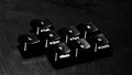
Week 4by chris48083Comment by tnun: Nice and gritty. Agree with others about DOF, also would like the L better aligned; but overall delivery suits original concept. |
 Photographer found comment helpful. Photographer found comment helpful. |
| 02/03/2008 02:58:41 PM |
Week 5by chris48083Comment by bassbone: you have captured a contemplative face - the side lighting works great to accentuate a really good face - like you said in your notes, you are unsure of the crop - i think there is a bit much neg space on the right, but the way it is right now actually makes me think and view longer - therefore, i think it works |
| Photographer found comment helpful. |
| 02/03/2008 08:34:28 AM |
Week 5by chris48083Comment by hajeka: Great face. I like the light and the contrast. Perhaps you should have used portrait mode here. |
| Photographer found comment helpful. |
| 02/03/2008 12:51:59 AM |
Week 5by chris48083Comment by colorcarnival: I love how your b/w conversion really helps emphasize the expression on his face. The whole photo has so much more drama now. And the lighting behind his head is a nice little extra effect. |
| Photographer found comment helpful. |
| 02/02/2008 01:25:20 PM |
Week 5by chris48083Comment by em3: Good lighting and tones in the conversion. Great self portrait. Well done! |
| Photographer found comment helpful. |
| 02/02/2008 03:24:41 AM |
Week 4by chris48083Comment by em3: Cool idea! I agree with comments already made with regards to DoF and a lighter background. |
| Photographer found comment helpful. |
| 02/02/2008 12:35:10 AM |
Week 5by chris48083Comment by wickee_one: I like how it almost seems as if you are in the spotlight. It is almost like you are being put on the spot, I think the negative space to the right of you adds to that. |
| Photographer found comment helpful. |
| 02/01/2008 11:41:52 PM |
|
| Photographer found comment helpful. |
| 02/01/2008 05:19:54 PM |
|
| Photographer found comment helpful. |
| 02/01/2008 01:37:16 AM |
Week 4by chris48083Comment by trevytrev: Really cool idea. I do feel that the DOf could be a bit larger so allthe letter could be in focus. I also think the keys themselves get lost in the background. Maybe a highkey on white background would get tehm to pop. |
| Photographer found comment helpful. |
Home -
Challenges -
Community -
League -
Photos -
Cameras -
Lenses -
Learn -
Help -
Terms of Use -
Privacy -
Top ^
DPChallenge, and website content and design, Copyright © 2001-2026 Challenging Technologies, LLC.
All digital photo copyrights belong to the photographers and may not be used without permission.
Current Server Time: 07/16/2026 12:03:05 PM EDT.