| Image |
Comment |
| 06/28/2004 03:15:52 AM |
|
| 06/28/2004 02:55:28 AM |
|
| 06/27/2004 10:03:43 PM |
|
| 06/26/2004 01:04:13 PM |
No Swimmingby jmsetzlerComment by tyt2000: I really like the tilt here, its very effective. I'm sure you're getting comments on the red not being "in your face", but I like the fact that you didn't make it pop out because its still noticable. Other people might find this to be a boring photo, but I honestly think that taking simple objects and making them look appealing in a photo is a work of art, not everyone has that type of vision. Great job... |
| 06/25/2004 11:48:38 PM |
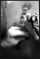
What Was He Thinking?by jmsetzlerComment by tony927: This is a great photo- the shallow depth of field- i can definately see this being used in a newspaper. I like the organic & mechanical aspects as well, good job |
| 06/25/2004 06:49:57 PM |
No Swimmingby jmsetzlerComment by Glacierwolf: Not enough color in the red part of the sign to quickly tell this pic from a black and white picture. An unwise choice of picture to use for this challenge. |
| 06/24/2004 10:58:37 PM |
|
| 06/24/2004 08:23:49 PM |
|
| 06/24/2004 03:55:14 PM |
|
| 06/24/2004 04:24:42 AM |
No Swimmingby jmsetzlerComment by Bran-O-Rama: Boring subject. Interesting angle and perspective, but that could be applied to any image. The angle or selective desat still doesn't improve this photo. |
Home -
Challenges -
Community -
League -
Photos -
Cameras -
Lenses -
Learn -
Help -
Terms of Use -
Privacy -
Top ^
DPChallenge, and website content and design, Copyright © 2001-2026 Challenging Technologies, LLC.
All digital photo copyrights belong to the photographers and may not be used without permission.
Current Server Time: 06/17/2026 04:02:04 PM EDT.