| Image |
Comment |
| 01/30/2008 03:39:25 PM |
urban childhoodby kolasiComment by colorcarnival: So why would something like this score so low? Lol the figures on this sign are way more detailed than the ones we have here. Nary a kid in sight and this sign is something that I think most would be able to relate to. I love all the lines and the white tones of this picture. It's a good shot that should have gotten a little more appreciation. |
 Photographer found comment helpful. Photographer found comment helpful. |
| 01/30/2008 12:27:49 AM |
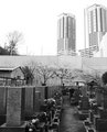
Graveyardby kolasiComment by RedDotCom: I think this tells a story - something about how the outside world continues on but the textures and tones within the cemetary walls are much more beautiful.
Personally, I love the bottom half of the image from the top of the fence down - I'd work on the sky and the lightness of the buildings.
Thanks for sharing! |
| Photographer found comment helpful. |
| 01/29/2008 07:11:42 PM |
|
| Photographer found comment helpful. |
| 01/29/2008 06:53:07 PM |
Graveyardby kolasiComment by CapeSail: I like the comparison you've made. You have nice detail and tones on the bottom. What you could do with this is replace the sky with a more interesting one, I actually have a library of just skies just for occasions like this. Especially when it's really blown, it's easy to select and delete. |
| Photographer found comment helpful. |
| 01/29/2008 02:14:58 PM |
|
| Photographer found comment helpful. |
| 01/29/2008 06:28:50 AM |
urban childhoodby kolasiComment by Camabs: mmmmm, been doubting what to vote on this one. I like the fact that the pole clearly stands out, and I am in general a fan of diagonals and vanishing points, both of which are clearly present in this pic. On the other hand, there's many distractions, giving the picture a snapshottish feel. Seems to me the sign is in Korean and finding an urban area in Korea without many distractions is near impossible, but than again you might want to try to avoid the distractions a bit more. Had you for instance taken one step to the left, then the electricity pole would have disappeared behind the sign, whereas now, the power lines lead my attention right to it.
Hope it helps. 6 |
| Photographer found comment helpful. |
| 01/29/2008 06:20:17 AM |
Graveyardby kolasiComment by jdannels: I love the line and similarities that you saw, and we have the same lens :)
A little tip to get some detail back in the building at least is to make a curve layer adjustment and just press okay. Then set it to multiply and open the curve again and play with the tones in the top. You can then mask out the bottom and get some dark tones in the building.
With that said I like it how it is. :) |
| Photographer found comment helpful. |
| 01/28/2008 03:19:08 PM |
Graveyardby kolasiComment by hajeka: Can't add much to the other comments. Perhaps you should add more contrast. Dark from the bottom to light in the sky. |
| Photographer found comment helpful. |
| 01/28/2008 12:30:48 PM |
Graveyardby kolasiComment by pineapple: The use of juxtaposition is what I learned from your photo. Coincidence in life is more common than we understand. |
| Photographer found comment helpful. |
| 01/28/2008 10:49:17 AM |
Graveyardby kolasiComment by nikolaos: Interesting perspective.. an idea would also be to darken the upper half if the image to give it a more grave mood. |
| Photographer found comment helpful. |
Home -
Challenges -
Community -
League -
Photos -
Cameras -
Lenses -
Learn -
Help -
Terms of Use -
Privacy -
Top ^
DPChallenge, and website content and design, Copyright © 2001-2026 Challenging Technologies, LLC.
All digital photo copyrights belong to the photographers and may not be used without permission.
Current Server Time: 07/18/2026 09:24:13 PM EDT.